Dashboard Overview
Dashboard Overview
Dashboard pages provide a centralized, high-level view of your organization's asset inventory and Source integration status within the Aurora ASM platform. From current and historical asset counts to detailed processing metrics, the Dashboard helps you understand how your data is collected, deduplicated, and correlated across your Sources. Interactive visuals such as the Asset Processing Pipeline and Enterprise Endpoint Controls Coverage Report make it easy to identify coverage gaps and explore trends over time. Additionally, you can use these pages to view information about Source health, create Custom Dashboards tailored to your organization's priorities, and access information about any queries you are tracking.
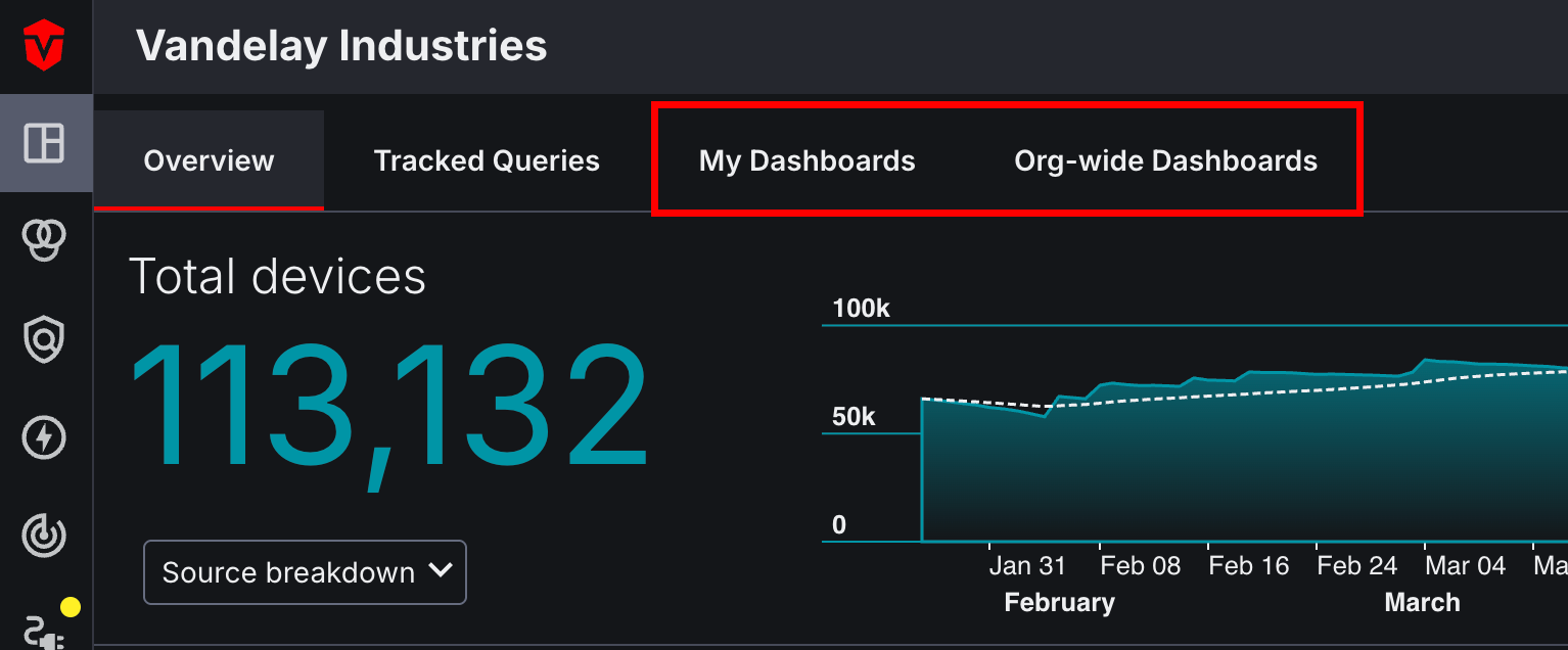
Overview
The Overview tab provides a high-level overview of both the history and current status of your Assets and configured Integrations. Additionally, it can also redirect you to other pages in the Aurora ASM platform where you can review information in greater detail.
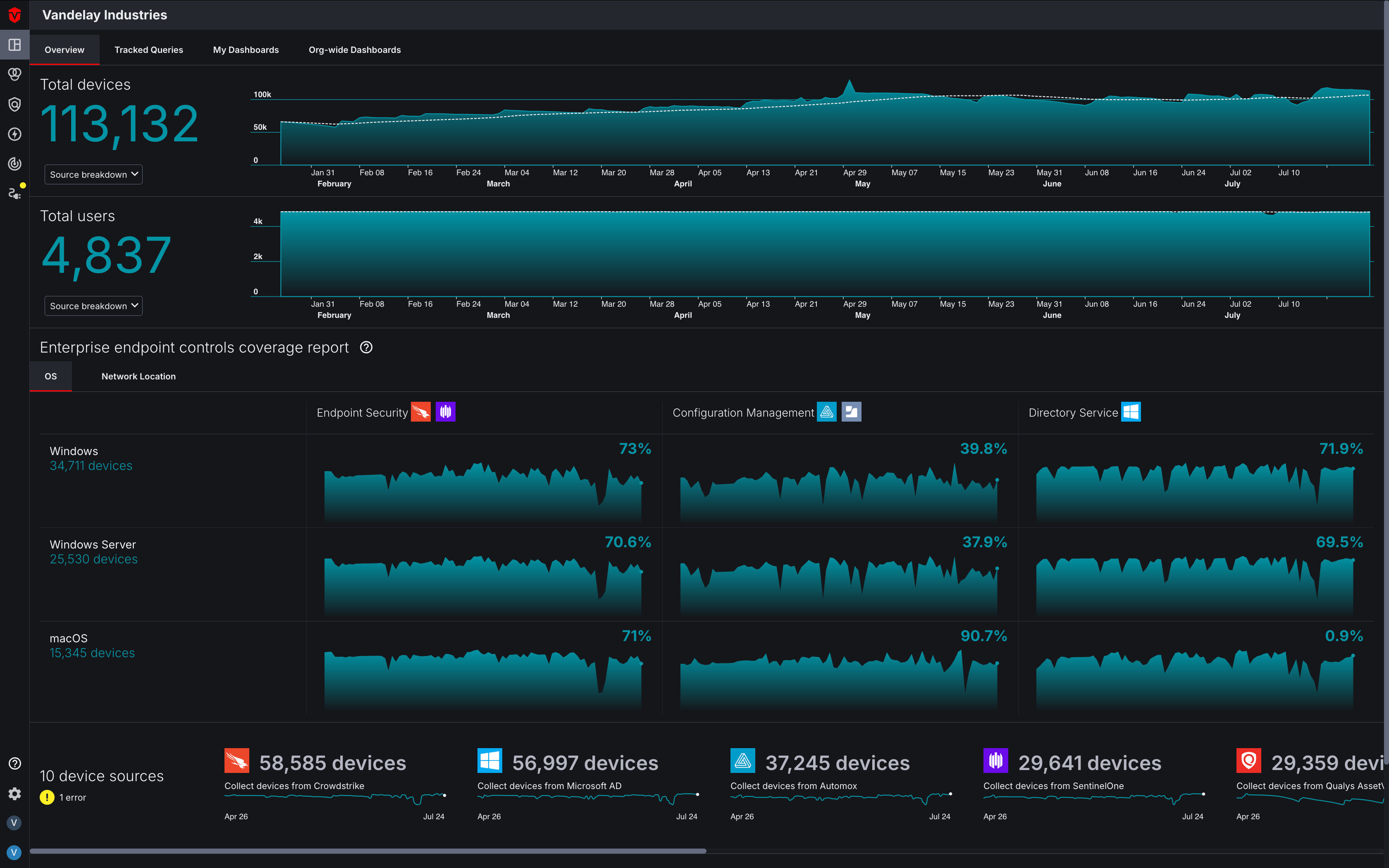
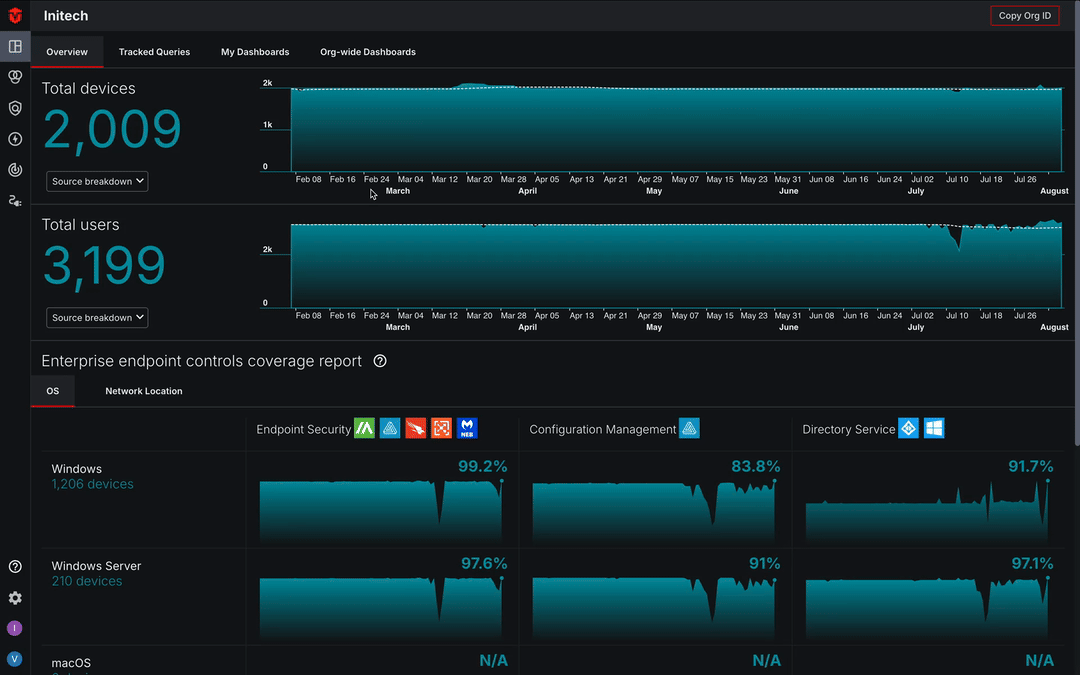
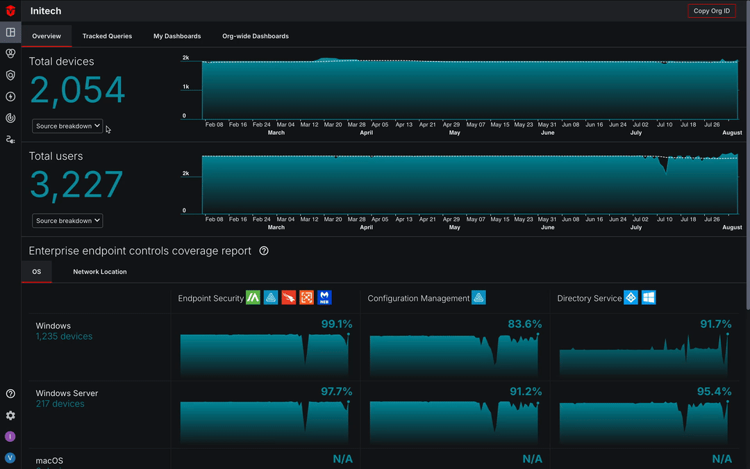
Asset Totals
Asset totals for Devices, Users, and Vulnerability Instances are located at the top of the Dashboard. On the left, you can find the total number of each respective asset in your Organization. The area graph on the right represents a timeline, providing insight into asset totals from previous days. Hovering over the graph near your desired date to specify asset totals for that day.
Source Breakdown
Selecting the Source breakdown dropdown in the bottom-left corner of an Asset Total section reveals an Asset Processing Pipeline graph. Asset Processing Pipeline graphs provide a visual representation of all of your Source asset records and how they processed by our Asset Correlation Engine (ACE) into unified assets. To view a Asset Processing Pipeline graph for a particular asset type, select the Source breakdown dropdown that corresponds to its Asset Total section.
Platforms with multiple Source Configurations are consolidated and represented as one Source on the Asset Processing Pipeline graph.
Devices and Users
Your Total Source Records are located on the left column of the graph. These totals represent all of the asset records that Aurora ASM has identified from each of your Source Configurations.
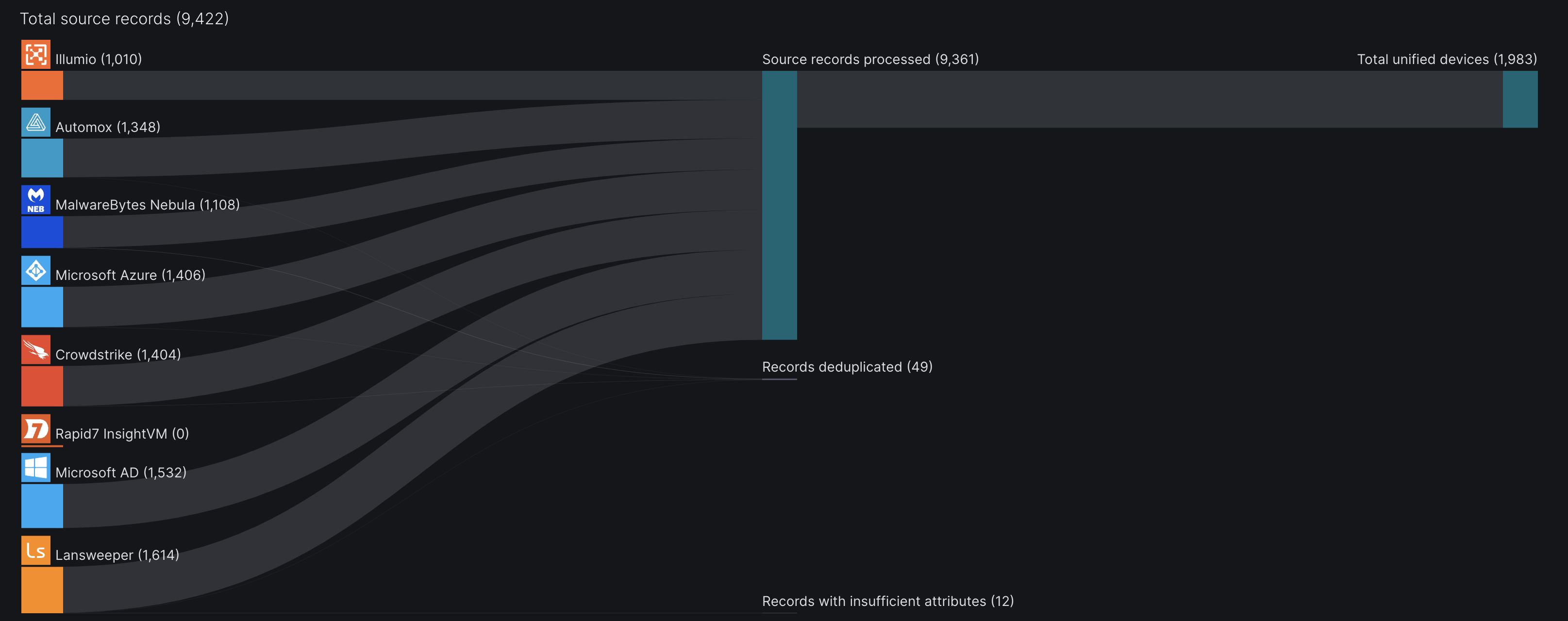
Hover over a Source to view how many of your identified asset records have been processed, deduplicated, or have insufficient attributes. More about this in the next section.
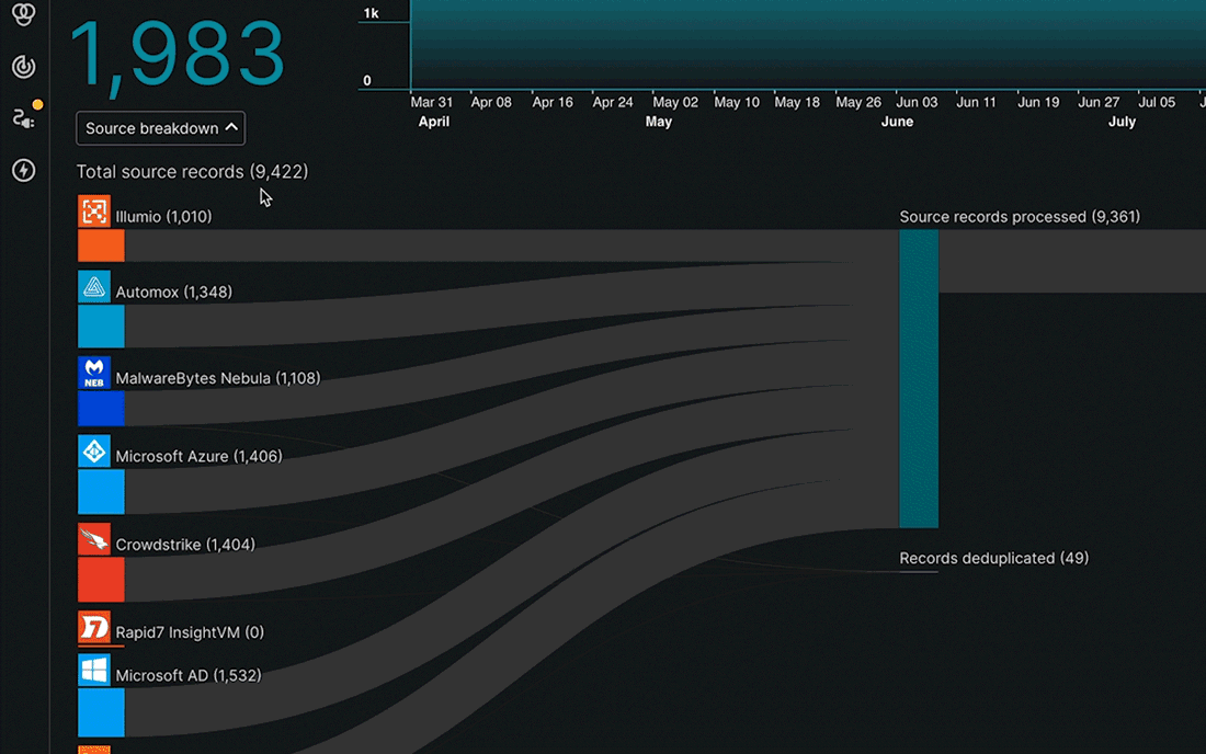
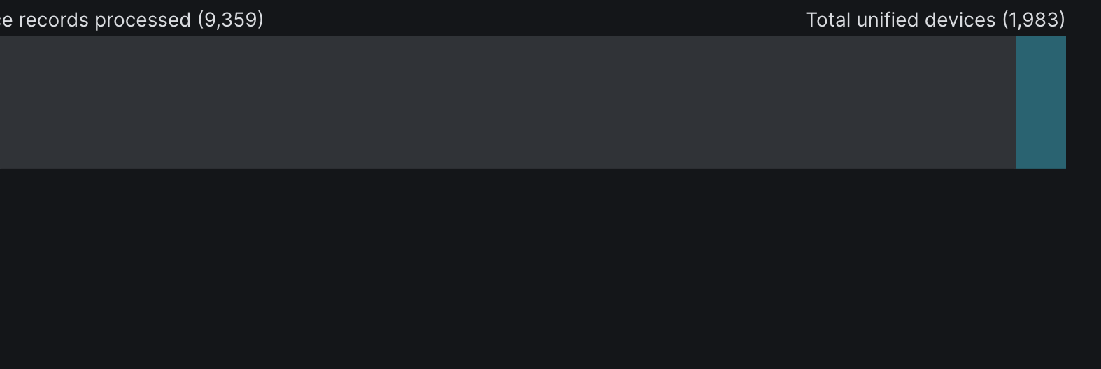
The center column of the graph shows three categories that asset records are sorted into after they have been identified.
Source Records Processed
This indicates the total number of records aggregated across all sources that will be further processed for correlation and deduplication.
Records Deduplicated
This indicates the total number of records across all sources that are considered to be duplicates records within the same sources and will not be further processed for correlation.
Records with Insufficient Attributes
This indicates the total number of records across all sources that did not provide adequate information and device attribute for proper correlation. Certain attributes of an asset must be provided by the source to positively and uniquely identify an asset.
The right column is the final stage of process and the total unique unified assets that represents your true active asset count in your environment after Aurora ASM has deduplicated, aggregated and correlated all source asset records.
Vulnerabilities
The Asset Processing Pipeline graph for Vulnerability Instances shares many similarities to the Device and User graphs. Let's break down the graph below and delve into how your vulnerability instances are processed by Aurora ASM.
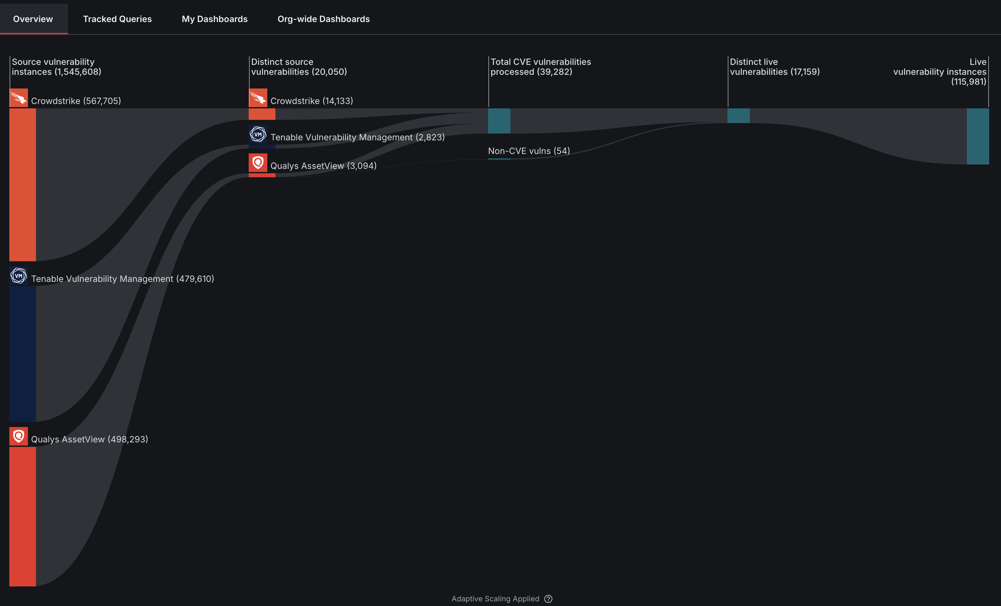
Source Vulnerability Instances
Source vulnerability instances are the raw instance counts as reported by each originating scanner/tool Source integrations, before cross-source deduplication. Hover over a Source to view its number of distinct source vulnerabilities. We'll cover this in more detail the next section.
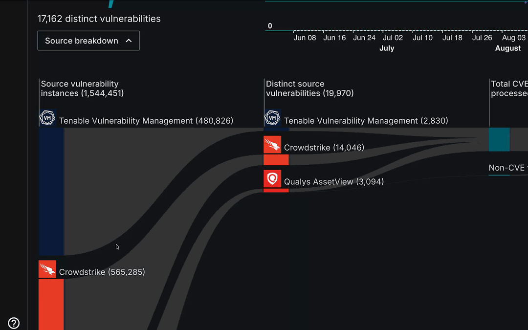
Distinct Source Vulnerabilities
Distinct Source Vulnerabilities are the unique vulnerabilities per Source, using that Source's native identifier (plugin ID, signature ID, etc.), before normalization to CVE or correlation across tools.
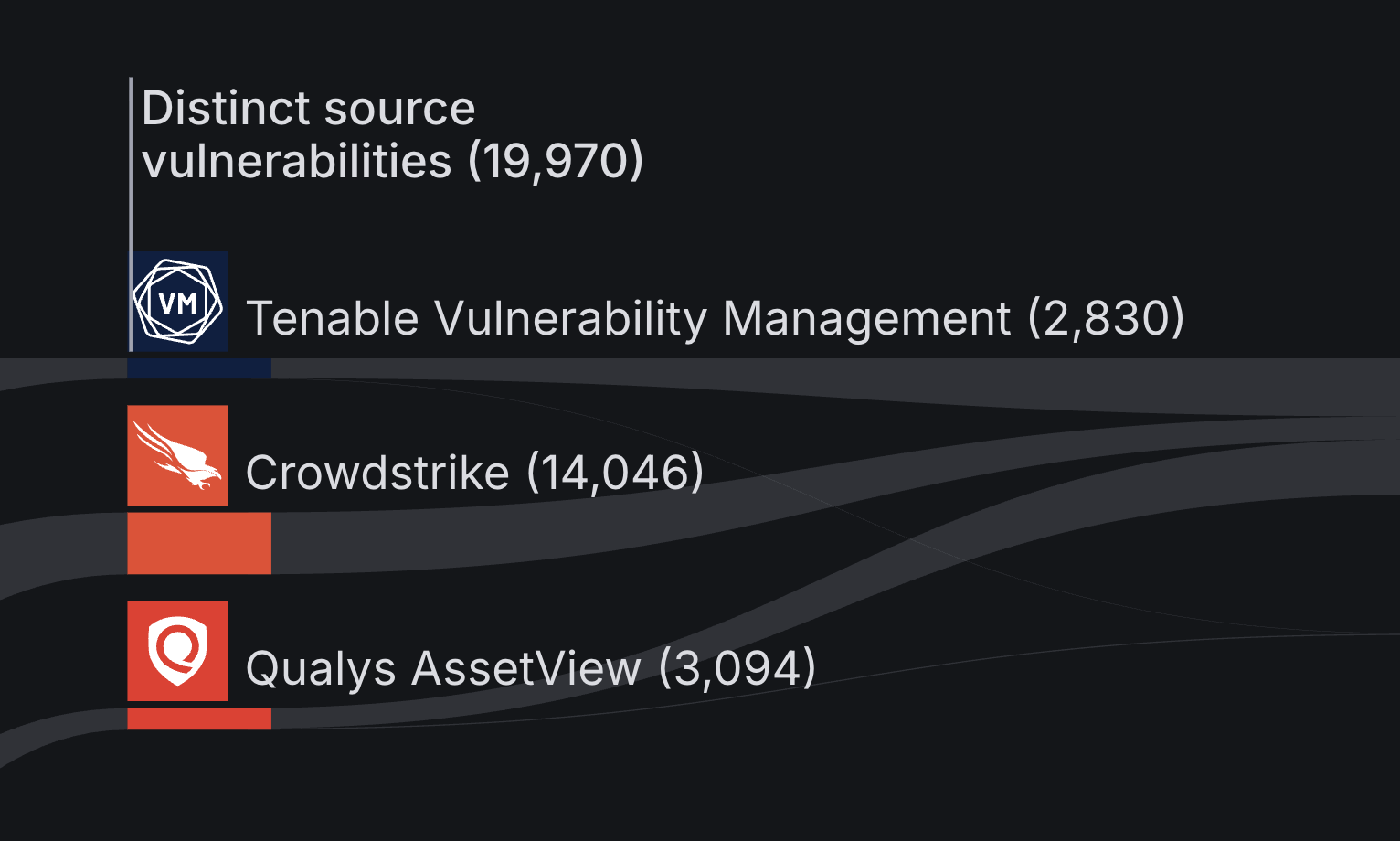
Once identified, distinct source vulnerabilities are broken out into CVE vulnerabilities, identified by each Source, and Non-CVE vulnerabilities, which are not.
- CVE Vulnerabilities – Vulnerabilities mapped to a standardized CVE identifier that are publicly-disclosed vulnerabilities included in the National Vulnerability Database (NVD). (Learn more)
- Non-CVE Vulnerabilities – Vulnerabilities that a Source has no associated CVEs for. These findings are commonly misconfigurations, compliance gaps, proprietary scanner findings, informational context about the device or vulnerabilities awaiting CVE assignment.
You can hover over a Source in this section of the graph to view its total number of CVE and non-CVE vulnerabilities.
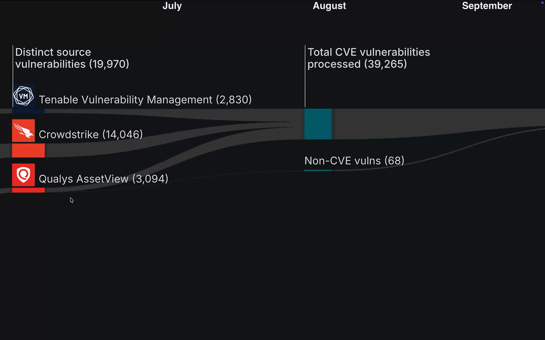
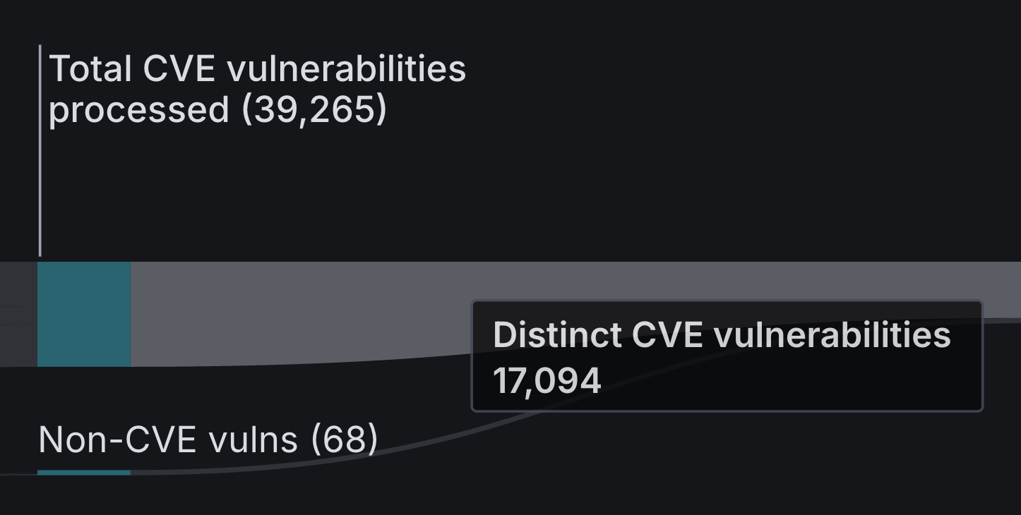
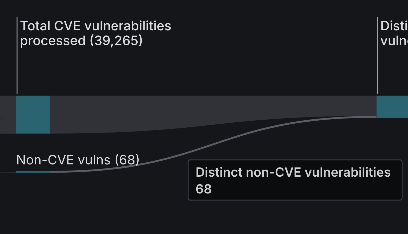
Total CVE Vulnerabilities Processed
The Total CVE Vulnerabilities Processed is all of the CVE vulnerabilities aggregated from your distinct source vulnerabilities.
Hover over this section to view the total number of distinct CVE vulnerabilities that have been deduplicated from your distinct source vulnerabilities processed as CVEs.
Additionally, this column also contains data on your total number of Non-CVE Vulnerabilities.
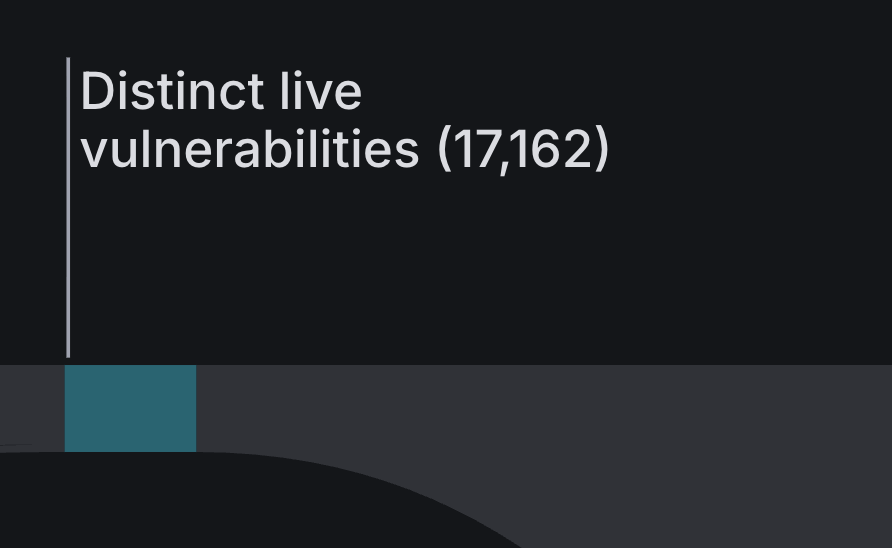
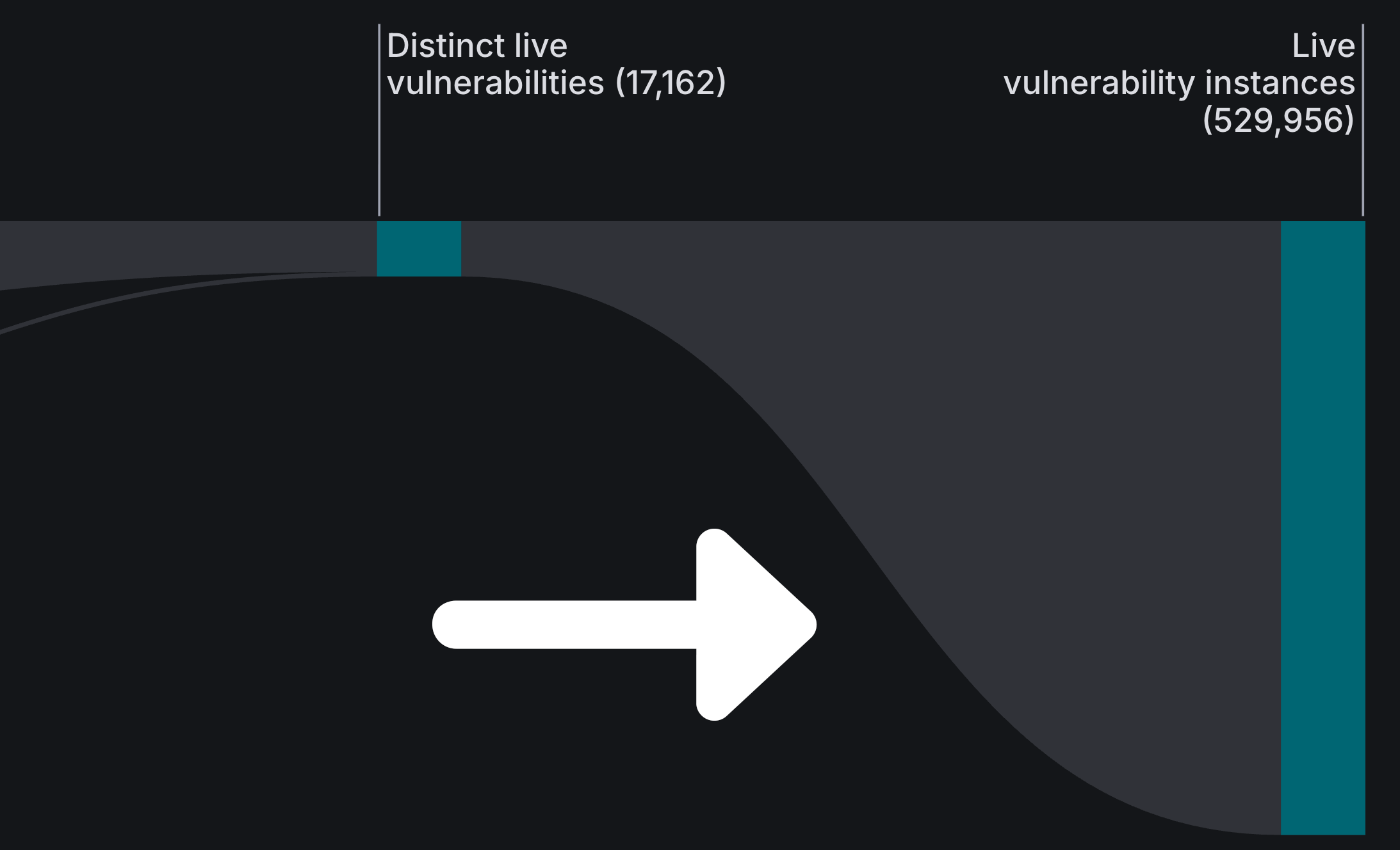
Distinct Live Vulnerabilities
Distinct Live Vulnerabilities are aggregated distinct CVE and non-CVE vulnerabilities from your Sources that are then deduplicated to provide the total number of distinct or unique vulnerabilities present in your environment associated with the devices Live Inventory.
Live Vulnerability Instances
Once the Asset Correlation Engine has determined how many unified distinct live vulnerabilities are in your environment, it then identifies each instance of a Device containing one. This gives you the total number of live vulnerability instances in your environment.
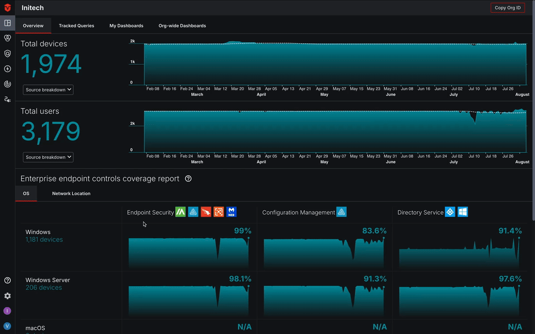
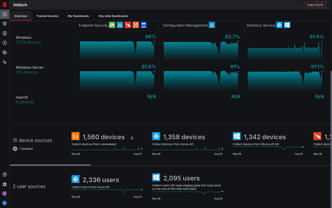
Enterprise Endpoint Controls Coverage Report
The Enterprise Endpoint Controls Coverage Report section of the Dashboard provides insight into device coverage by Integrations falling under the Enterprise Endpoint category. Endpoint Security, Configuration Management, and Directory Services integration types are included in this category and coverage can be reviewed by operating system (OS) or Network location
-
Icons listed at the top of a column represent the Integrations you've configured that are included in its Enterprise Endpoint category.
-
The total number of devices associated with a Network Location or Operating System are listed in the far-left column.
-
The Percentages and totals in each cell represent devices with coverage by an Integration in the Enterprise Endpoint category it is listed under.
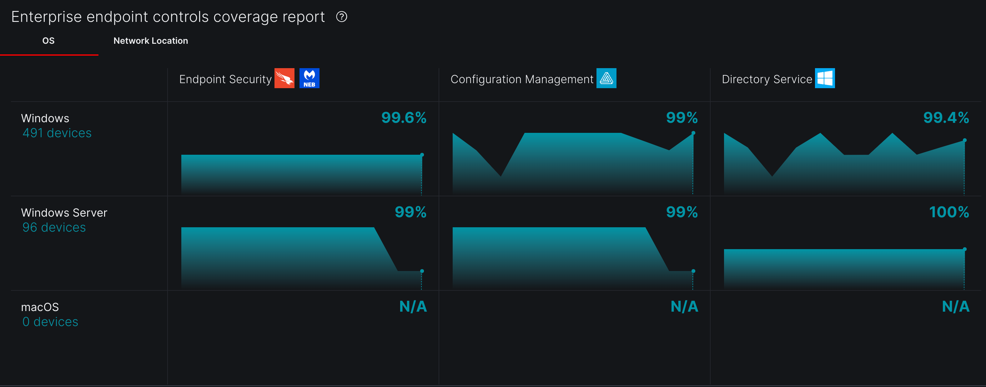
Use the tabs to navigate between the OS and Network Location views.
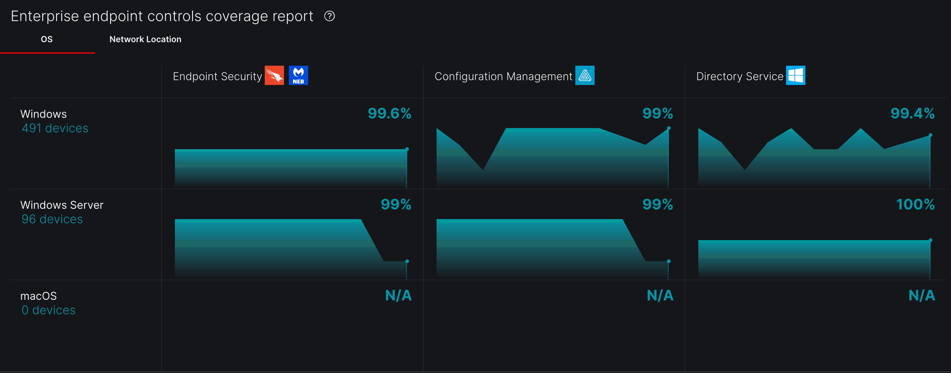
The trend timeline in each cell provides a visual representation of the last 90 days of its device coverage. Hover over the timeline to view coverage details for a specific day.
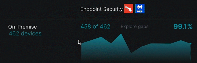
Select the Explore coverage gaps link in any cell to be redirected to the Device Inventory page where you can view additional information about its corresponding devices.
Source Inventory Overview
The Source Inventory Overview section provides a snapshot of the Source Integrations you've configured. In this section, you will find information about the total number of assets identified by each Integration, disabled Integrations, and Integration errors.
You can also view asset totals from previous days by hovering over an Integration's timeline.
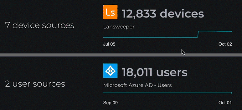
Select an Integration to view its Source Inventory page, where you can find additional information about it.
Tracked Queries
In addition to the main Dashboard page, there is also an additional Tracked Queries page that can be accessed by selecting the Tracked Queries tab at the top of the Dashboard. This page tracks specific queries over time. It features a handful of Global Queries that can be viewed by anyone in your Organization. Additionally, you may also add custom queries to the My Queries and Org-wide Queries lists.
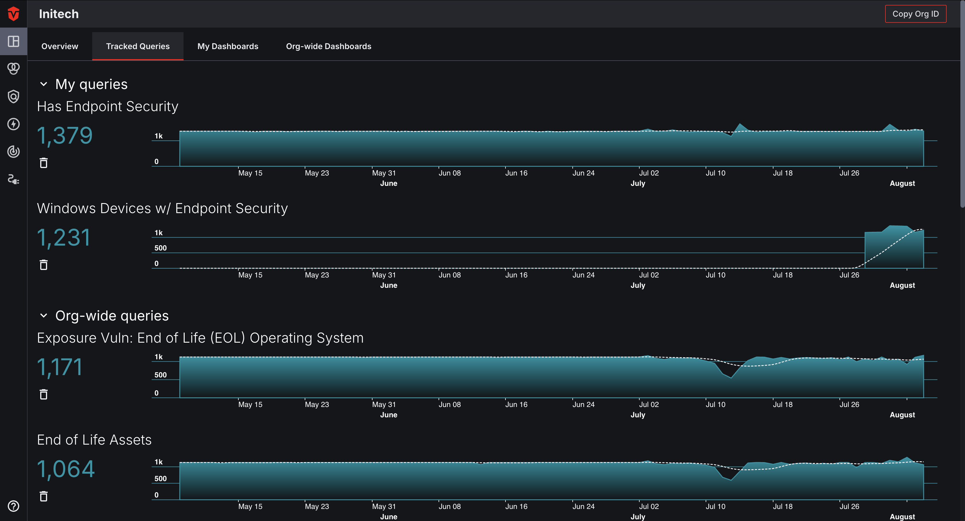
Learn more about the Tracked Queries page.
Custom Dashboards
Custom Dashboards allow users to curate a personalized analytics experience. Using customizable modules, users can choose what data they would like to include on the page and how said data should be displayed (i.e. bar chart, line graph, etc.) Each module can be configured to display information about a particular asset type in your asset inventory. Alternatively, you may also restrict the number of assets included using a saved query.
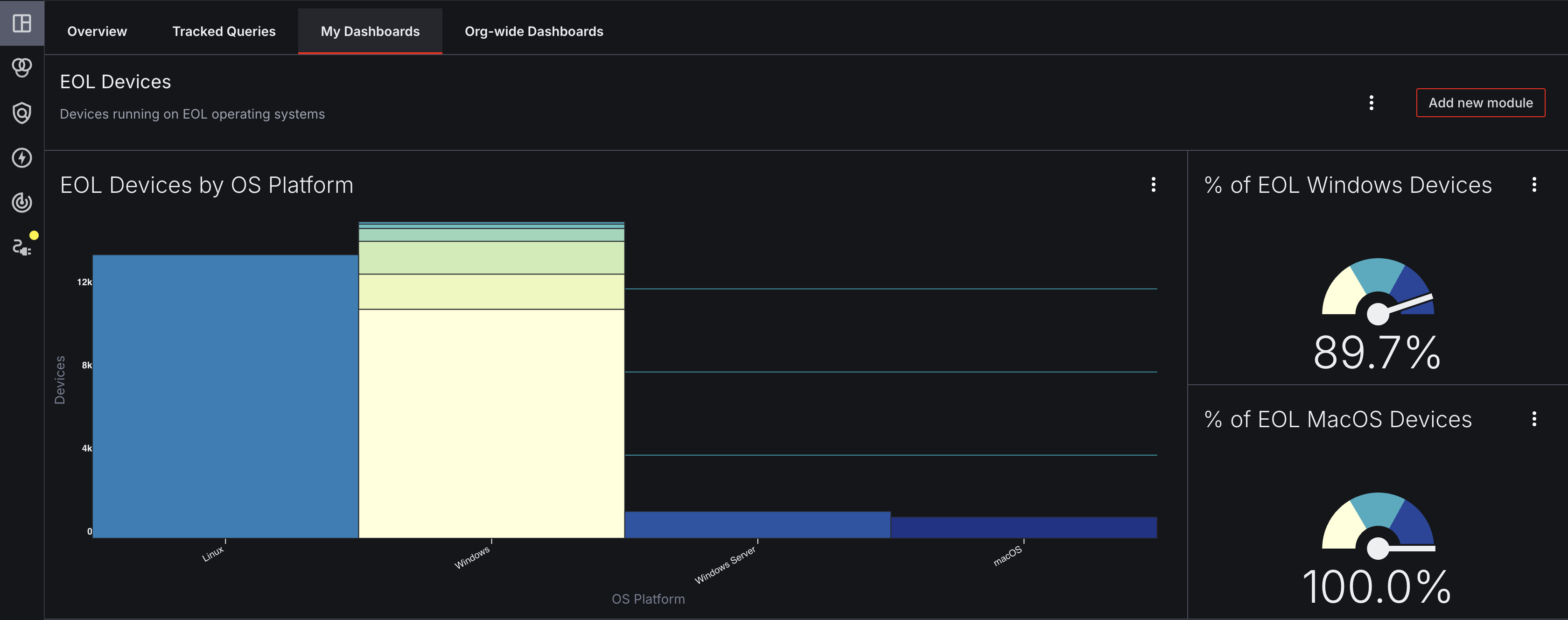
The Custom Dashboard tabs are labeled as My Dashboards and Org-wide Dashboards at the top of the page.
Learn more about the Custom Dashboards page.
Updated 2 months ago