Creating Custom Dashboards
Overview
Custom Dashboards allow users to curate a personalized analytics experience. Using customizable modules, users can choose what data they would like to include on the page and how said data should be displayed (i.e. bar chart, line graph, etc.) Each module can be configured to display information about a particular asset type in your asset inventory. Alternatively, you may also restrict the number of assets included using a saved query.
On this page, you may wish to create modules to display data about the following:
- Percentage of Devices running on end-of-life operating systems, by OS Platform
- Percentage of Devices with missing security controls
- Asset coverage by a particular Source
Custom Dashboard Types
Users have the option to create two kinds of Custom Dashboards:
Personal Dashboards
- Personal dashboards are only visible to the users who have created them.
- A combination of personal and org-wide queries can be used in these dashboards.
Org-wide Dashboards
- Org-wide dashboards are visible to all users in your organization once they have been created.
- Only org-wide queries can be used in these dashboards.
Creating a Custom Dashboard
Users can create up to 50 personal and 50 org-wide Custom Dashboards.
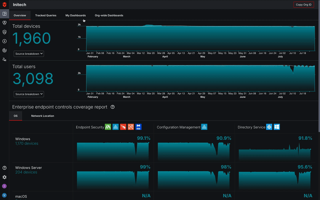
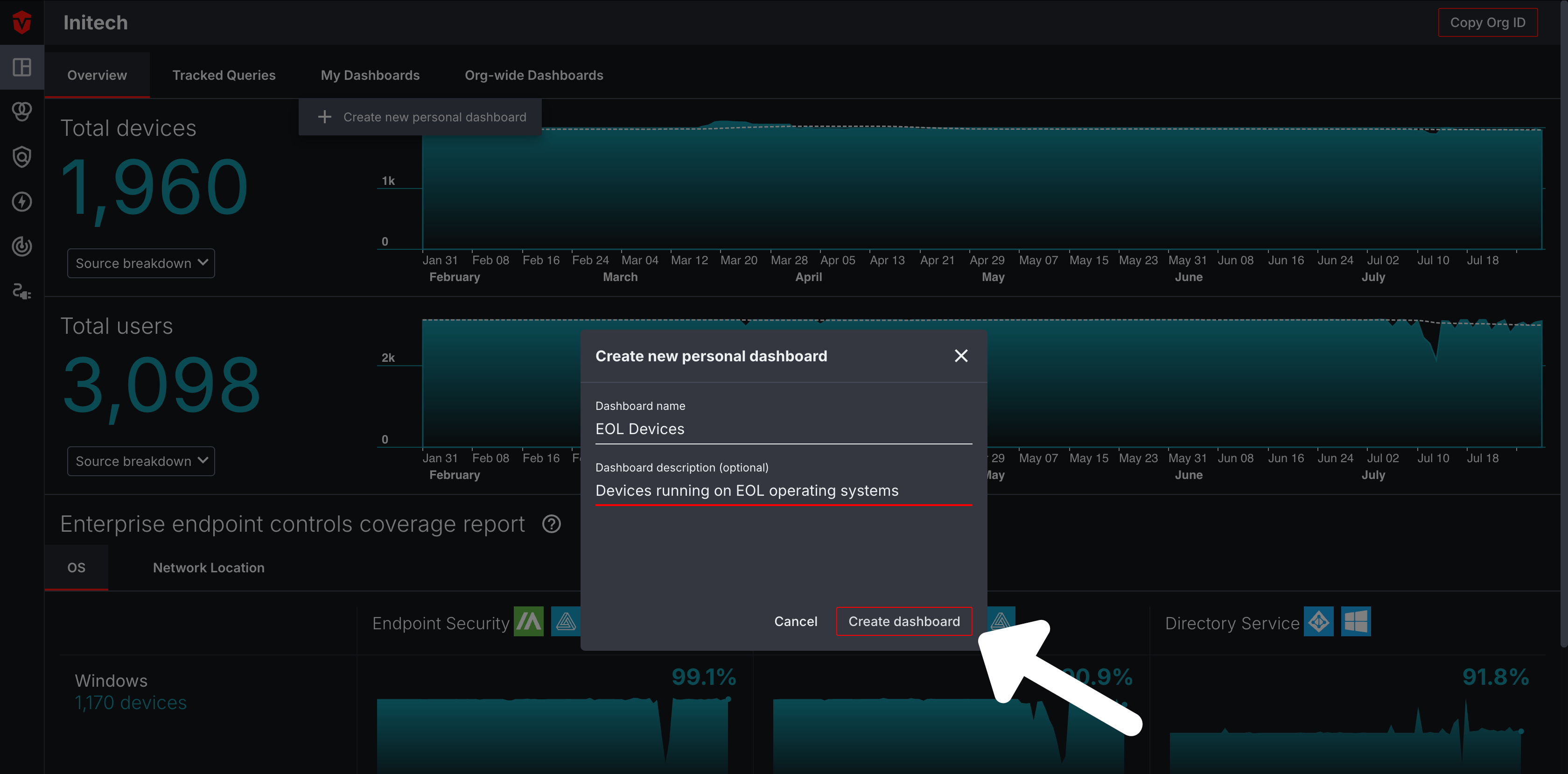
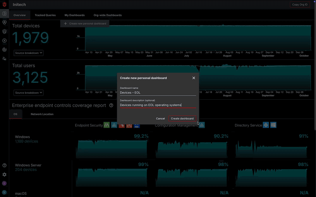
You can add a Custom Dashboard by clicking the My Dashboards or Org-wide Dashboards tab at the top of the Dashboard page and selecting the Create new dashboard link from the dropdown.
Use the Dashboard name field to name your Custom Dashboard. Optionally, you can use the Dashboard description field to write a brief description about your dashboard. Once you have finished click the Create dashboard button to create it.
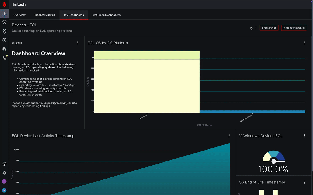
Once your Custom Dashboard has been created, you will be redirected to its page. We will review adding content to this page in a later section.
Accessing Custom Dashboards
Custom Dashboards can be accessed by clicking the My Dashboards or Org-wide Dashboards tab at the top of the Dashboard page and selecting your dashboard from the dropdown.
Adding a Module
Note While the use of saved queries is not mandatory, incorporating them into your modules will allow you to get the most value out of this feature. We recommend taking inventory of your existing saved queries and adding any new ones you may wish to include in your modules ahead of time.
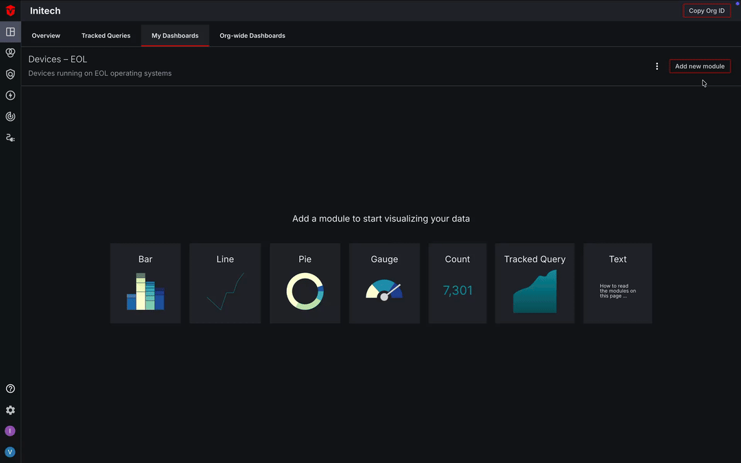
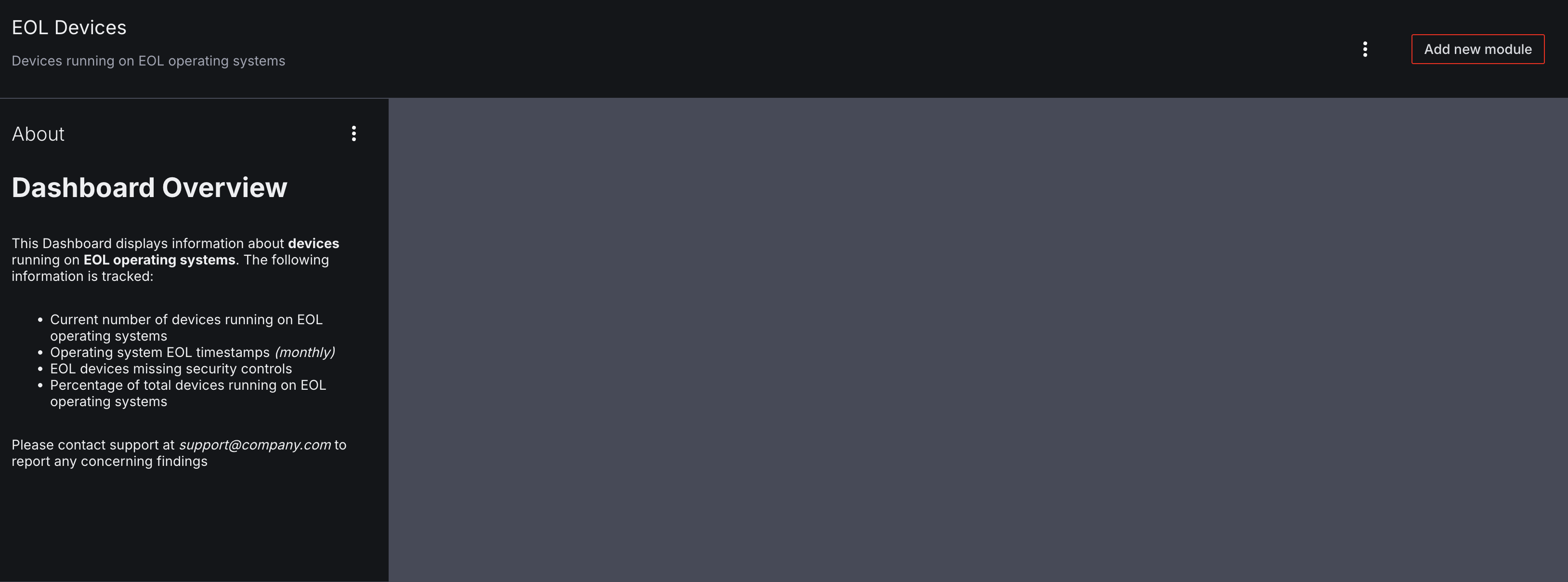
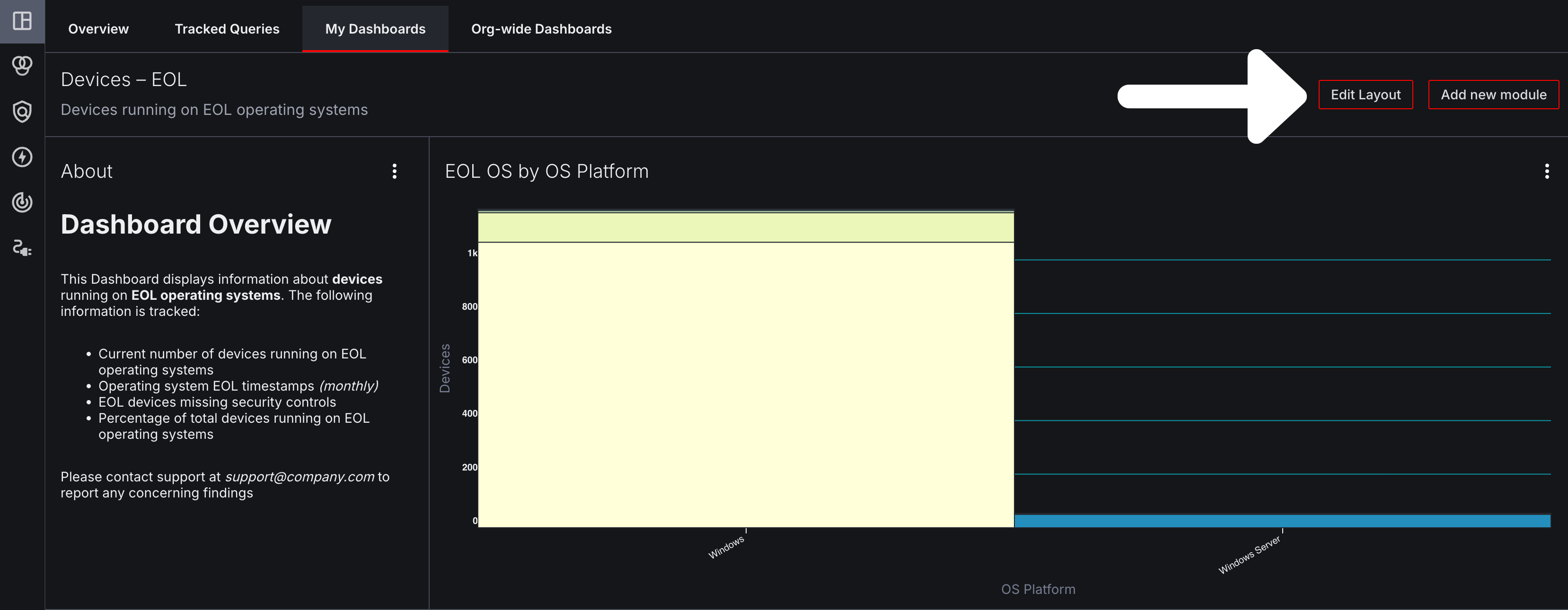
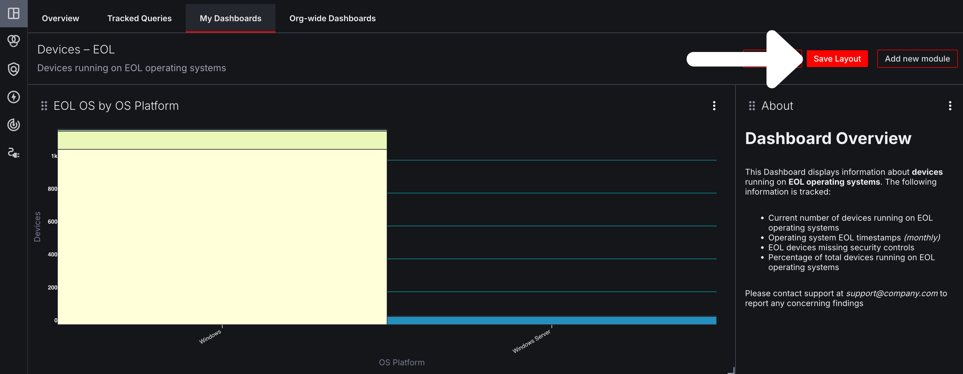
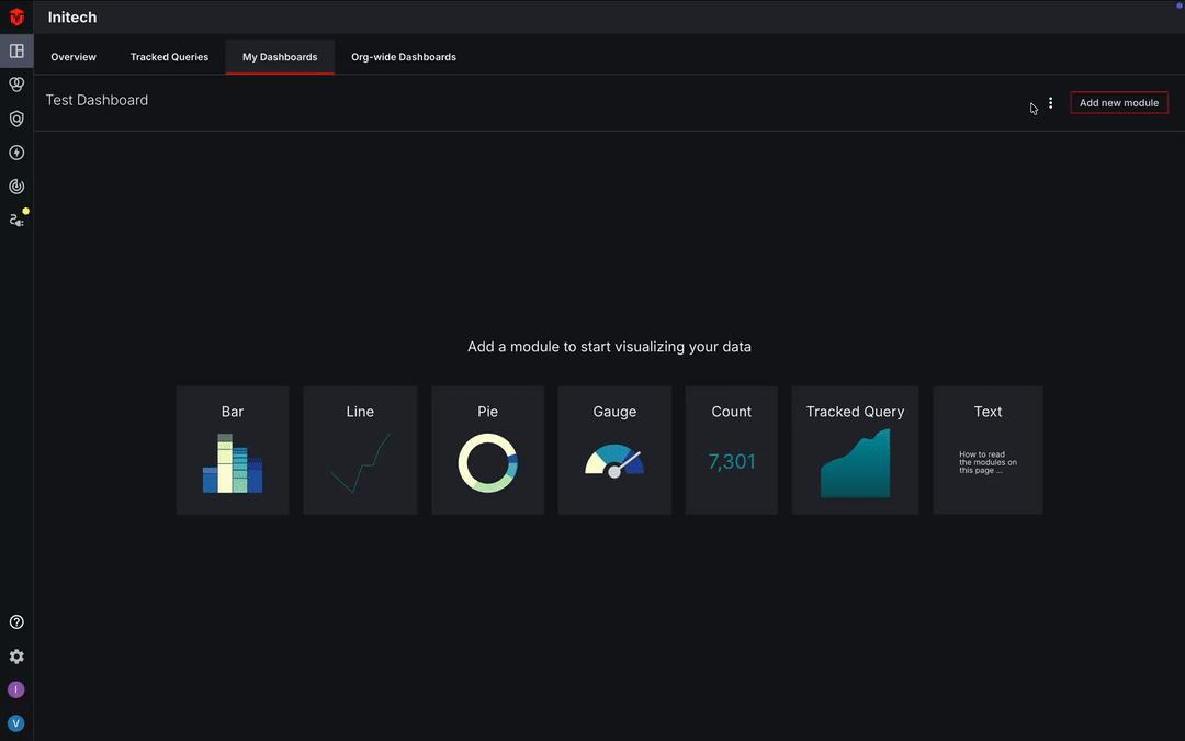
Once you are on your Custom Dashboard page, it should appear blank. From here you will need to add modules to it with the information that you would like to be displayed on the page.
In this example, we will select the Add new module button to add a module.
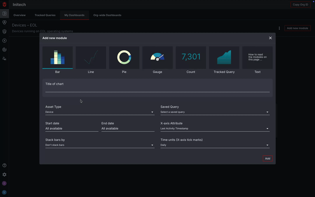
Next, select a module Type and enter information into the provided fields. Descriptions of each module type can be found in the Module Types section of this document.
Once you have finished entering your information, click the Add button to add it to your Dashboard.
After you have added a few modules, you may want to adjust their size and how they are arranged on the page. We'll cover this in the Module Layout section of this document.

Module Types
Note: If you are editing an Org-wide dashboard, only org-wide queries can be used in your modules.
In the Module window, there are seven options for types of modules you can add. In this section, we will review each of these.
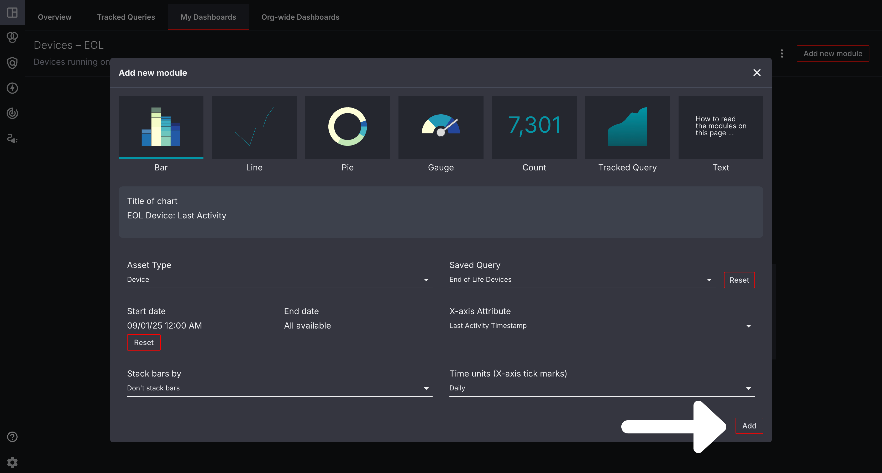
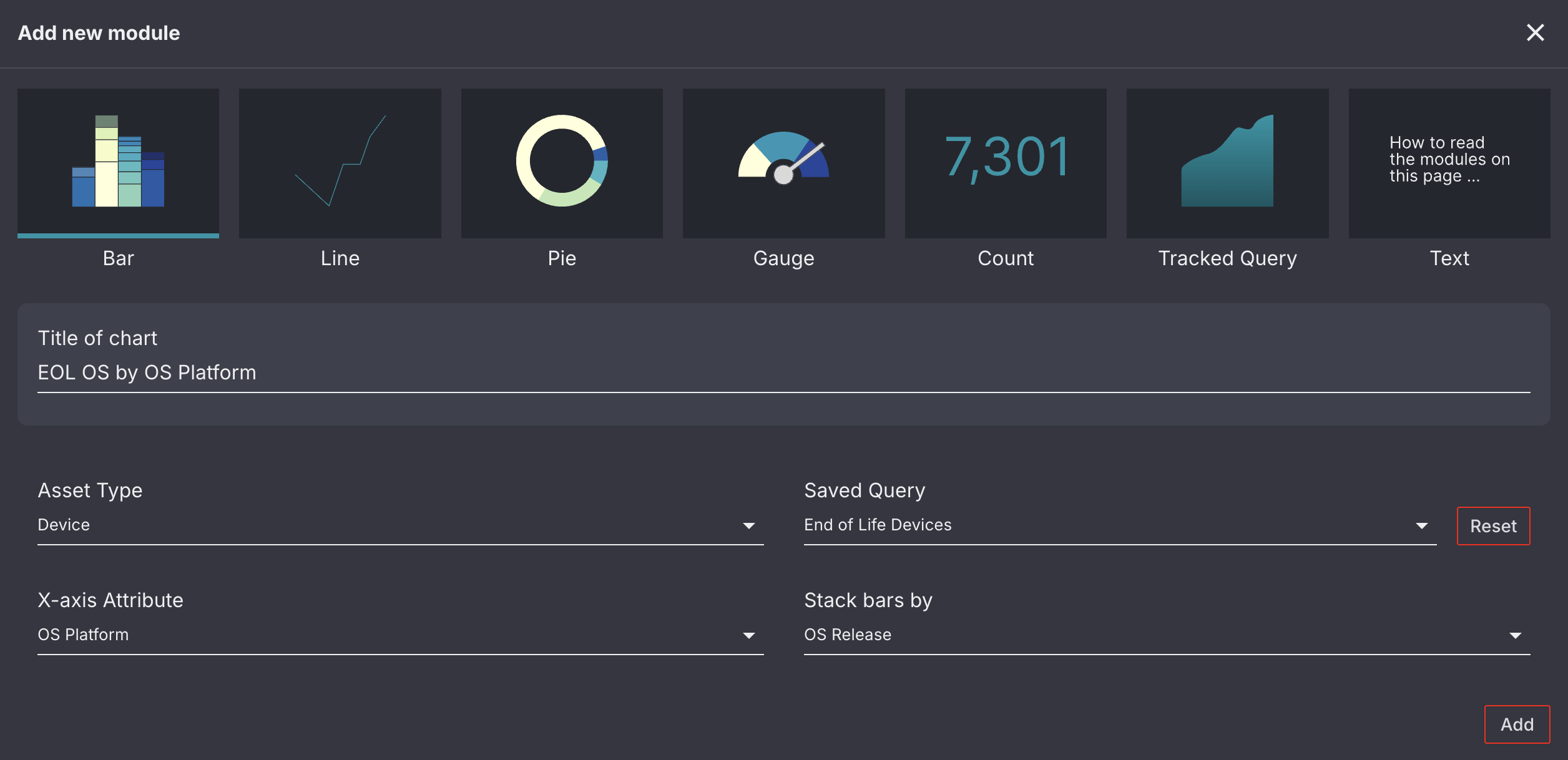
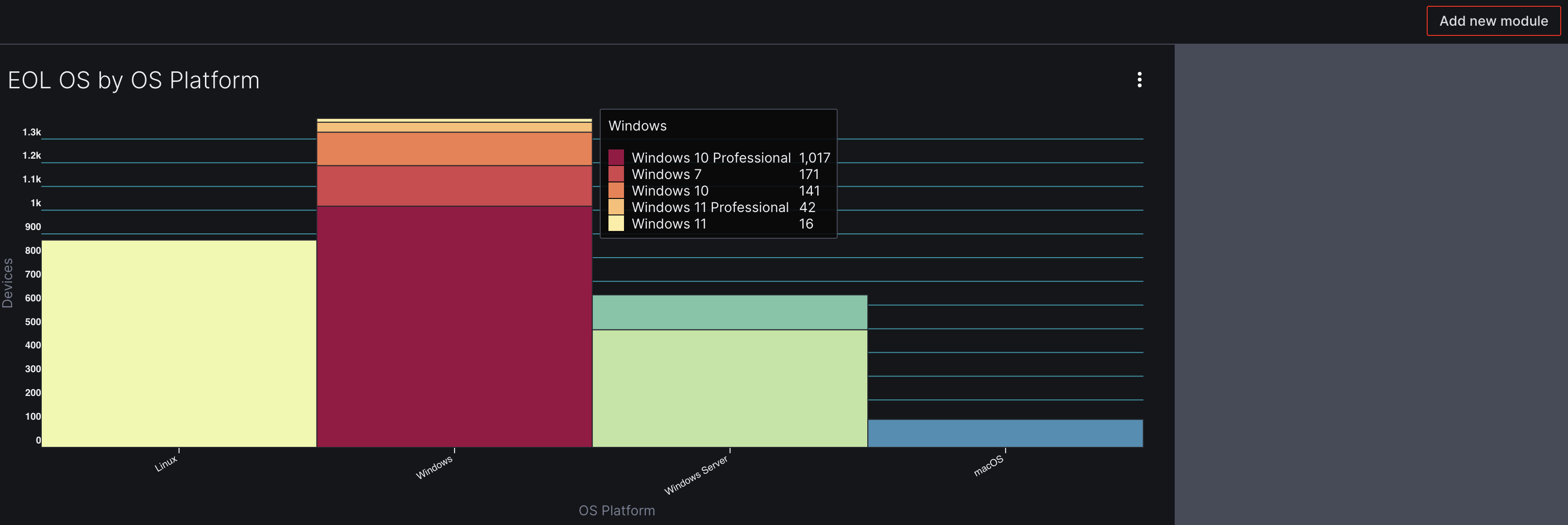
Bar
The Bar module displays asset analytics in the form of a bar graph. Like other modules, it allows you to exclude certain assets from your results using a saved query (i.e. Only filtering for Devices running on EOL Operating Systems).
- Use the Asset Type field to select the asset type you would like to build your module around.
- Next, select the Saved Query you would like to include assets from. If this field is left blank, the Aurora ASM platform will pull asset data from your entire inventory.
- The X-axis Attribute is used to specify what attribute you would like to organize your results by. In this example, we will choose
OS Platformas our X-axis Attribute. - The Stacked Bars By dropdown can be used to further divide the
X-axis Attributeresults in your bar graph. This field is optional. In this example, we will be selectingOS Releaseso that eachOS Platformis further broken down byOS Releasein the graph.
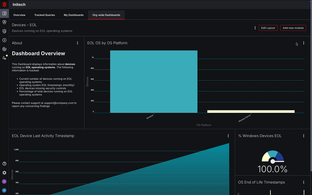
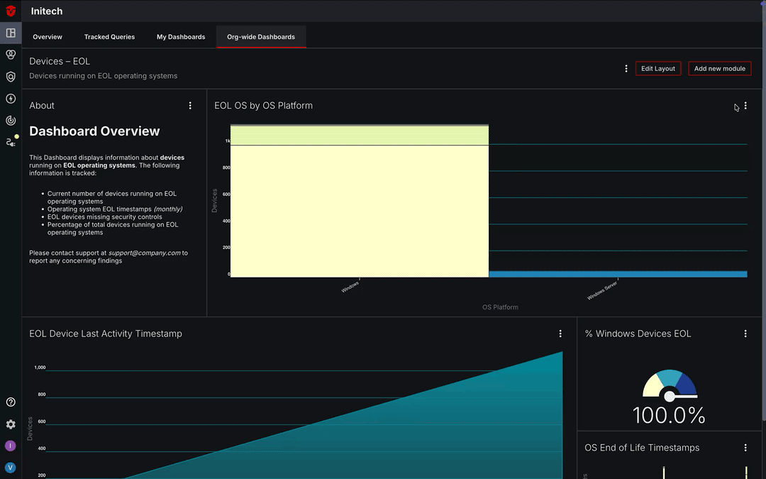
The images below display the configuration and output for a stacked bar chart that displays the total number of devices running on end-of-life operating systems (using a previously saved query), grouped by OS Platform and OS Release.
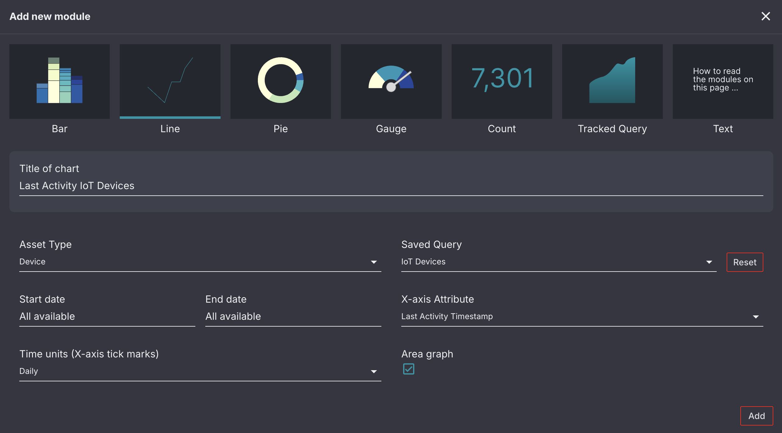
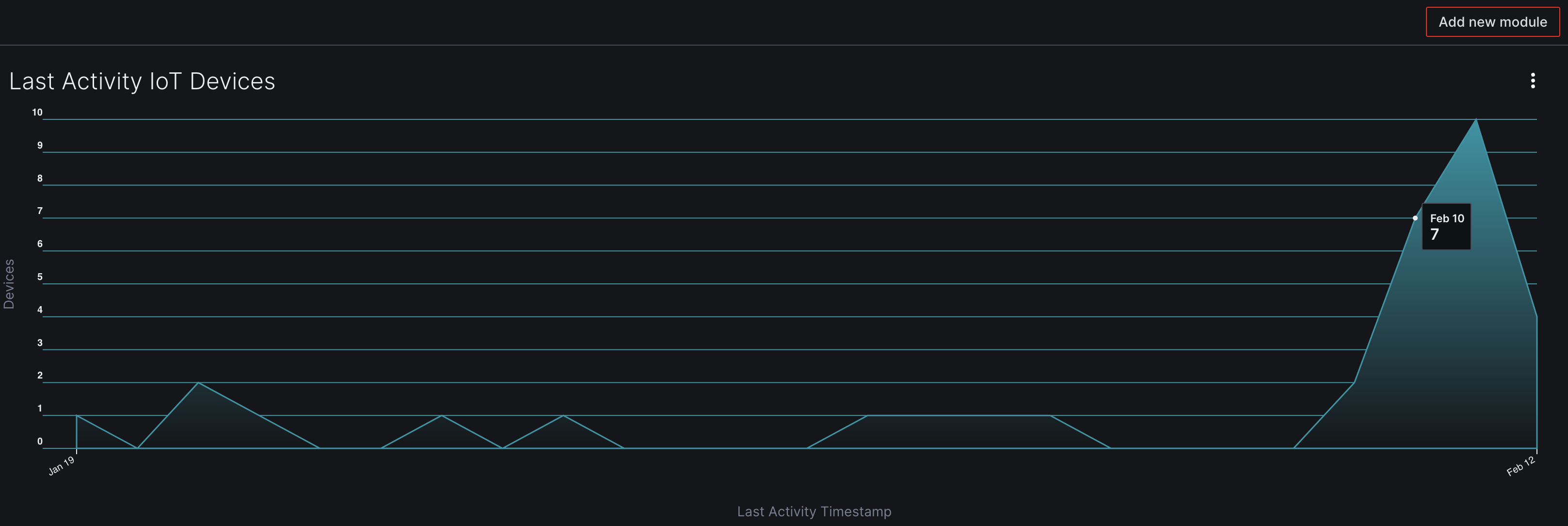
Line
The Line module displays information about an attribute over time in the form of a line or area graph.
- Use the Asset Type field to select the asset type you would like to build your module around.
- Next, select the Saved Query you would like to include assets from. If this field is left blank, the Aurora ASM platform will pull asset data from your entire inventory.
- The X-axis Attribute is used to specify what time-based attribute you would like to organize your results by. In this example, we will choose
OS End of Life Timestampas our X-axis Attribute. - The Time Units dropdown allows you to specify what time unit you would like your X-axis to use when displaying information. We will choose
Daily. - The Start and End Date fields allow you to set the time frame you would like to include in your graph. If left blank, the graph will display results from the earliest to most recent instance of an attribute.
- Check the Area Graph checkbox if you would like your graph to display as an area graph
The images below display the configuration and output for an area graph that displays the daily number of Last Activity Timestamps for devices categorized as IoT (using a previously saved query) for the last 30 days.
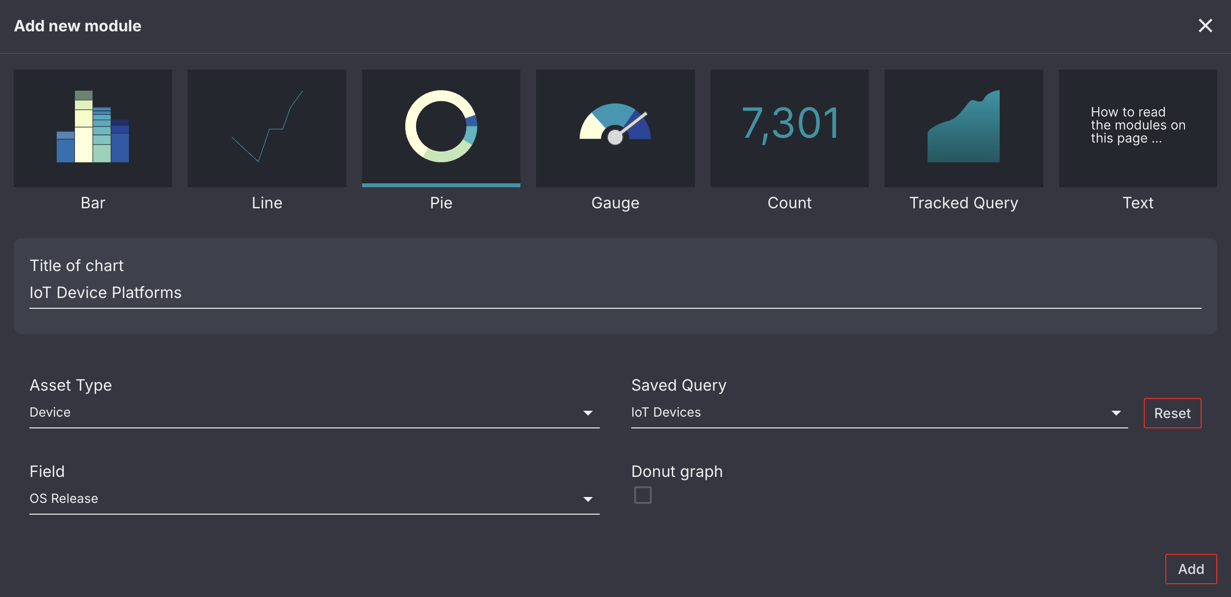
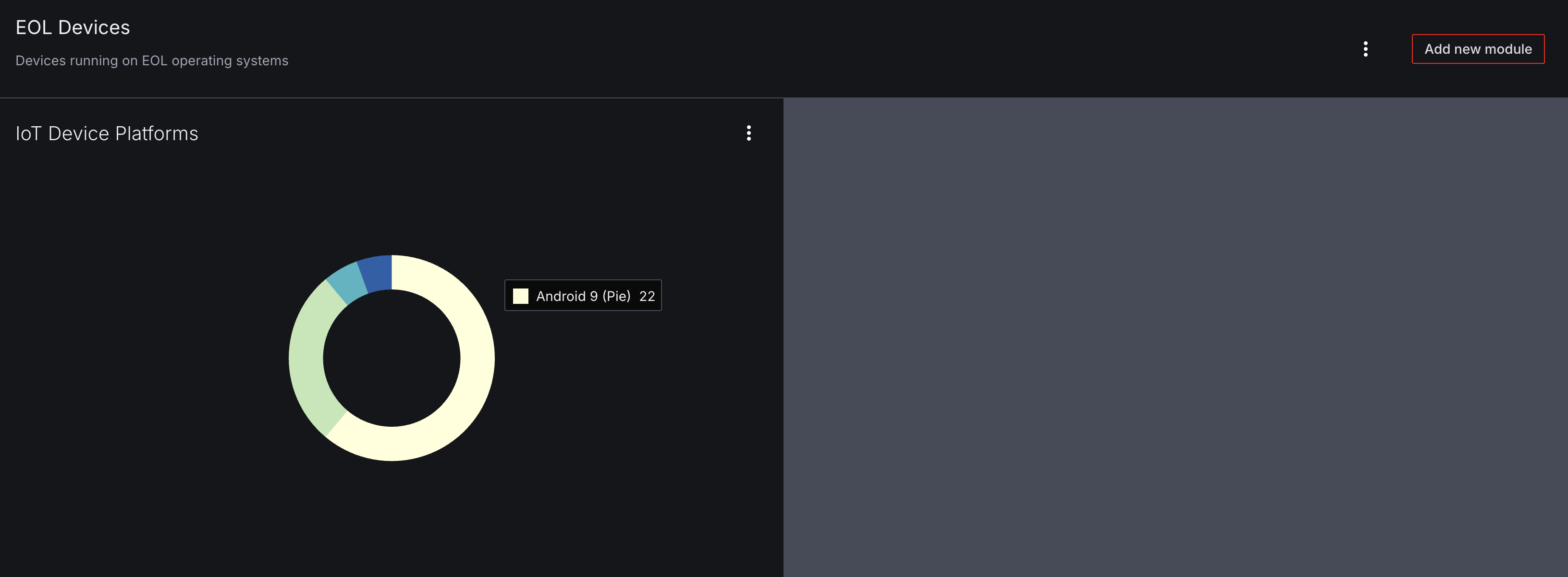
Pie
The Pie module displays information about asset attributes in the form of a pie chart.
- Use the Asset Type field to select the asset type you would like to build your module around.
- Next, select the Saved Query you would like to include assets from. If this field is left blank, the Aurora ASM platform will pull asset data from your entire inventory.
- Use the Field dropdown to select the attribute you would like your assets to be broken down by.
- Select the Donut graph checkbox to display your pie chart as a donut graph.
The images below display the configuration and output for a pie chart that displays devices that are categorized as IoT (using a previously saved query) by OS Release.
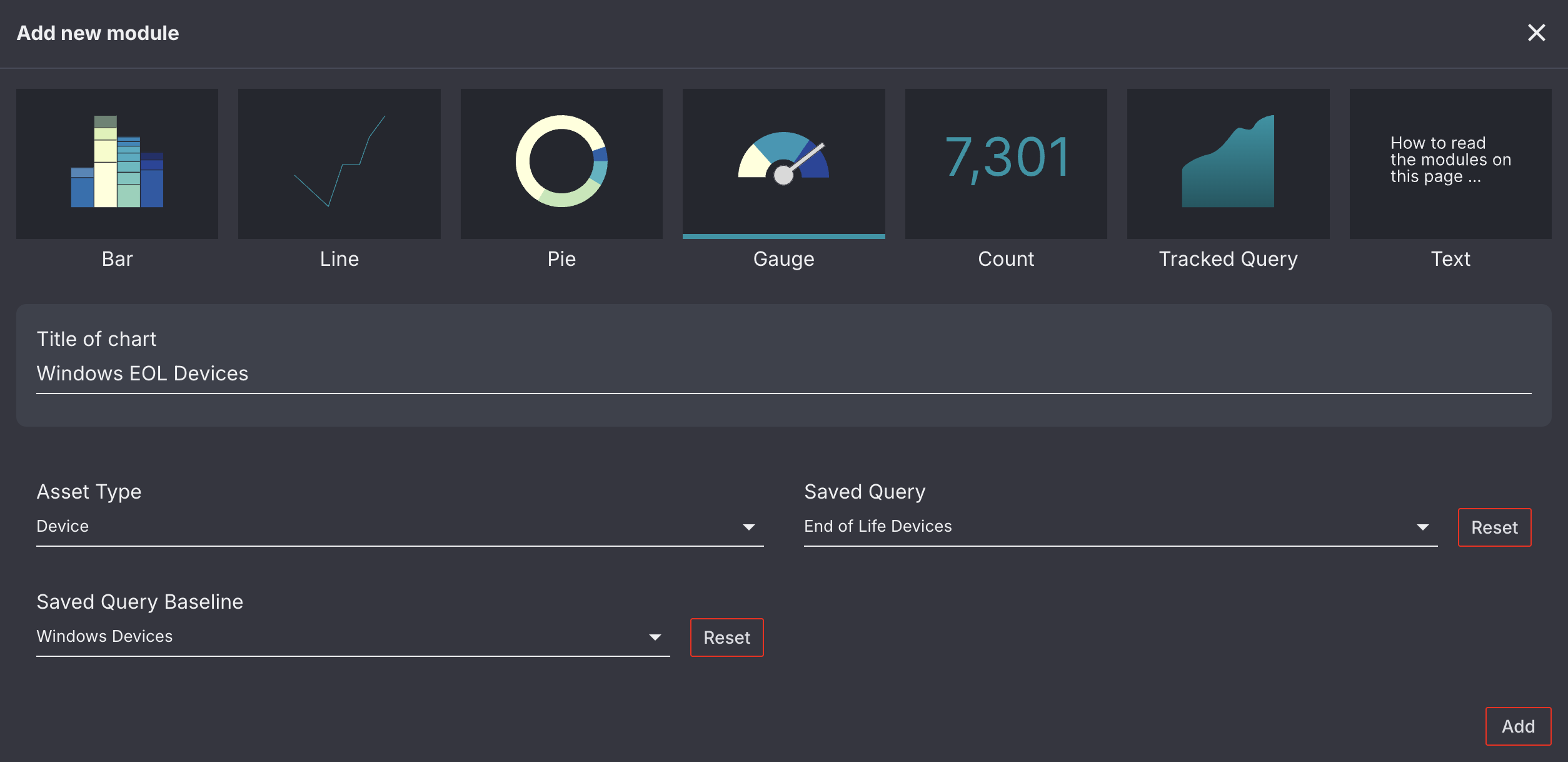
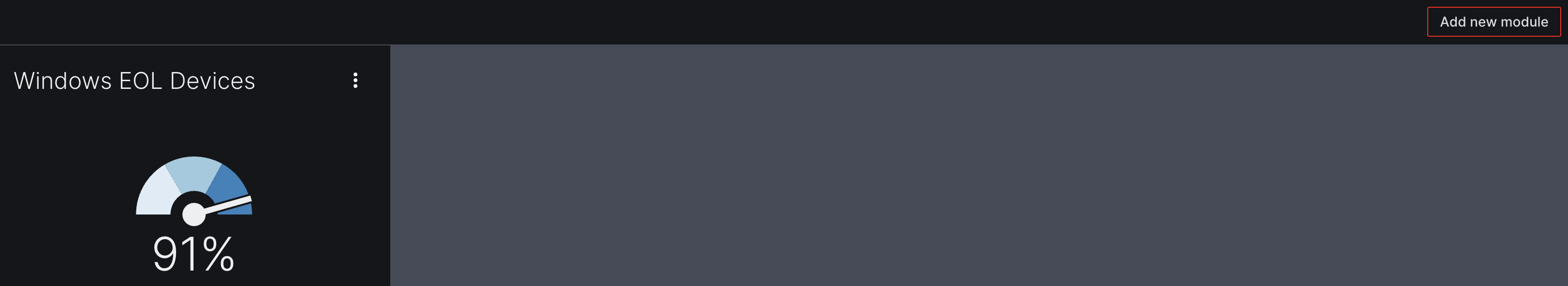
Gauge
The Gauge module displays what percentage of your selected asset type meets the criteria in a saved query. This information is displayed as a gauge that resembles a speedometer.
- Use the Asset Type field to select the asset type you would like to build your module around.
- Next, select the Saved Query you would like to compare your assets against (i.e. a query that returns end-of-life devices).
- The Saved Query Baseline dropdown allows you to specify what subset of assets you would like to compare the assets in your saved query against (i.e. a query that only returns Windows devices).
The images below display the configuration and output for a percentage gauge that displays the percent of devices running on Windows operating systems that are also end-of-life devices. Two previously saved queries were used to identify this percentage.
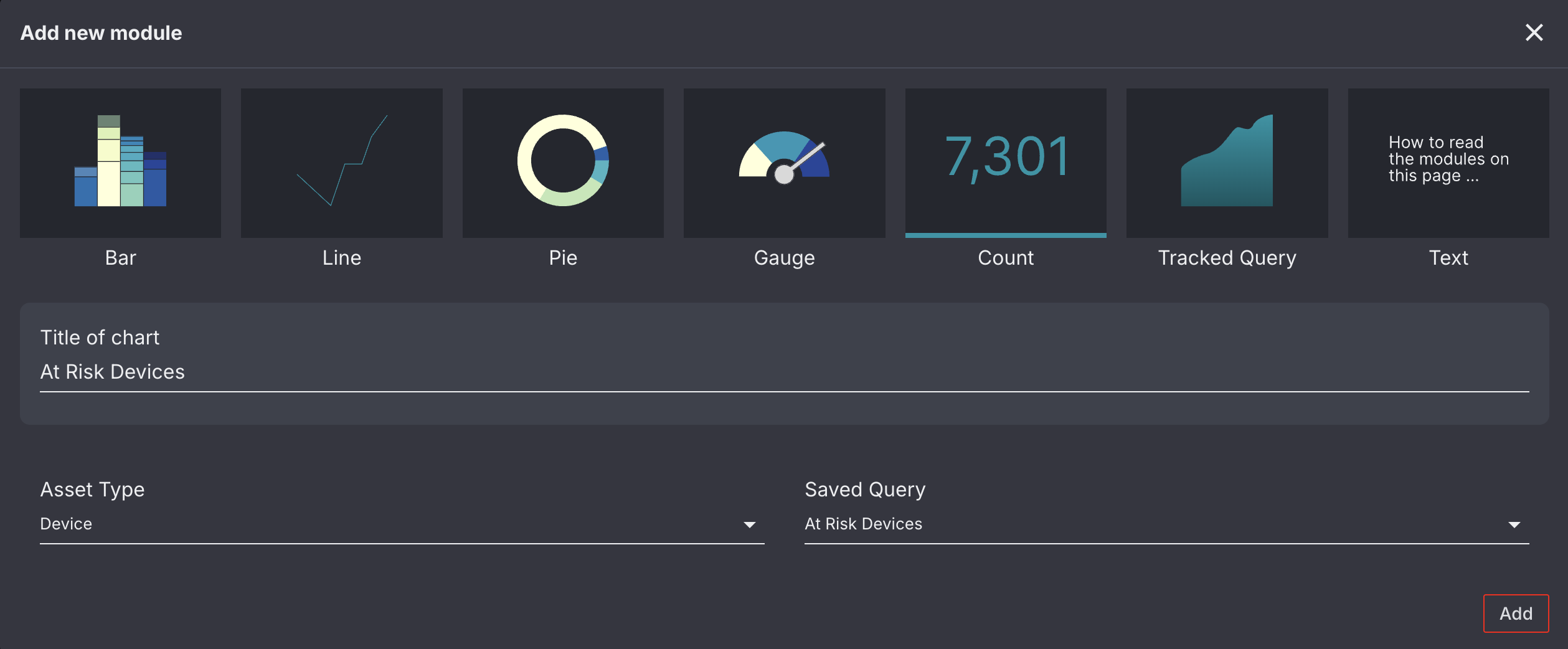
Count
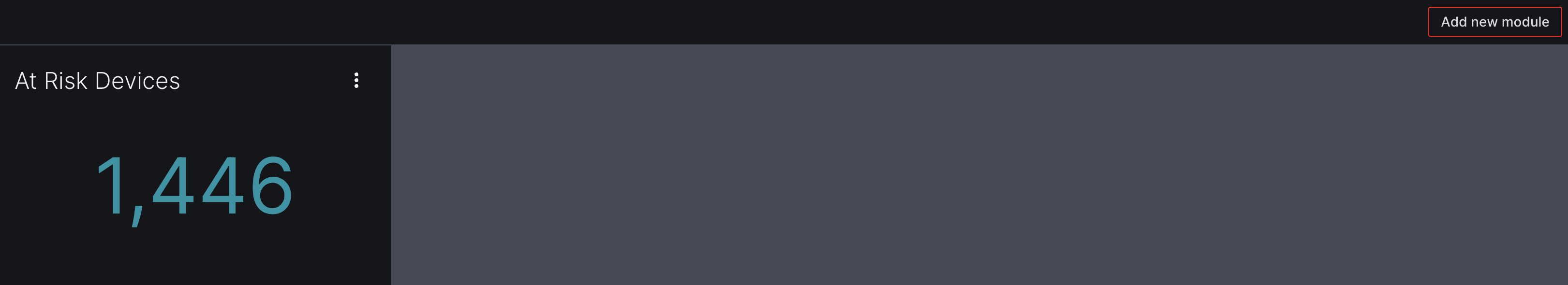
The Count module displays the total number of your selected asset type.
- Use the Asset Type field to select the asset type you would like to build your module around.
- Next, select the Saved Query you would like to include assets from. If this field is left blank, the Aurora ASM platform will pull asset data from your entire inventory.
The images below display the configuration and output for a total count of the number of at risk devices (using a previously saved query).
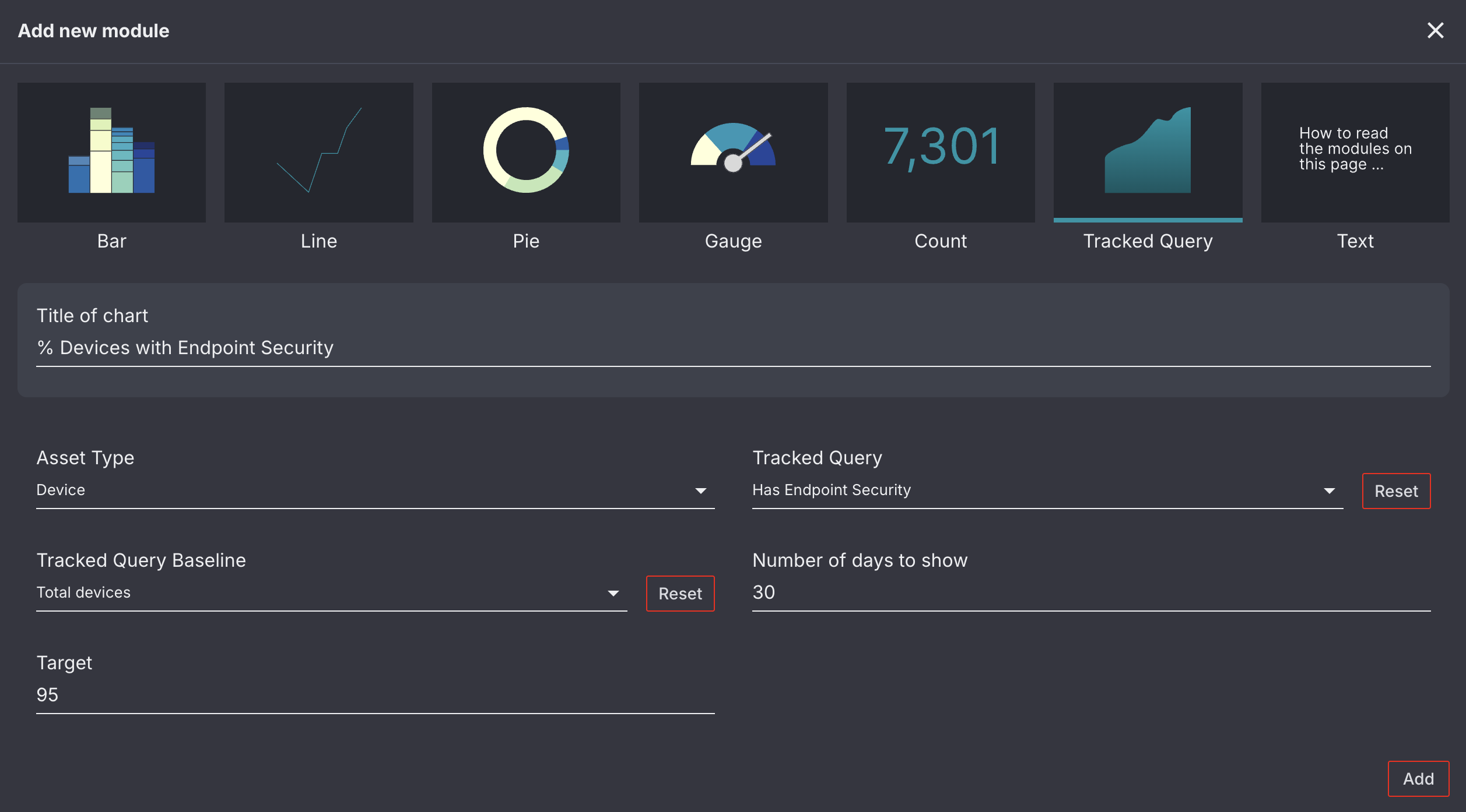
Tracked Query
The Tracked Query module is used to track the number of a particular subset of assets on a day to day basis. This is done using your tracked queries. While queries on the Tracked Queries page search your entire asset inventory to determine daily asset totals, the Tracked Query module for custom dashboards allows you to select a Tracked Query Baseline. This allows you to determine what percentage of assets from your Tracked Query Baseline also meet the criteria of another tracked query.
- Use the Asset Type field to select the asset type you would like to build your module around.
- Next, select the Tracked Query you would like to view daily totals for (i.e. a query that tracks the number of Windows devices with endpoint security controls).
- The Tracked Query Baseline dropdown allows you to specify what subset of assets you would like to compare the assets in your Tracked Query against (i.e. a query that tracks the number of Windows devices).
- The Number of days to show field allows you to specify how many days in the past you would like the module to collect data for. This field defaults to 90 days.
- The Target field allows you to specify the desired percentage of your Tracked Query Baseline assets that you would like to match the conditions for your Tracked Query.
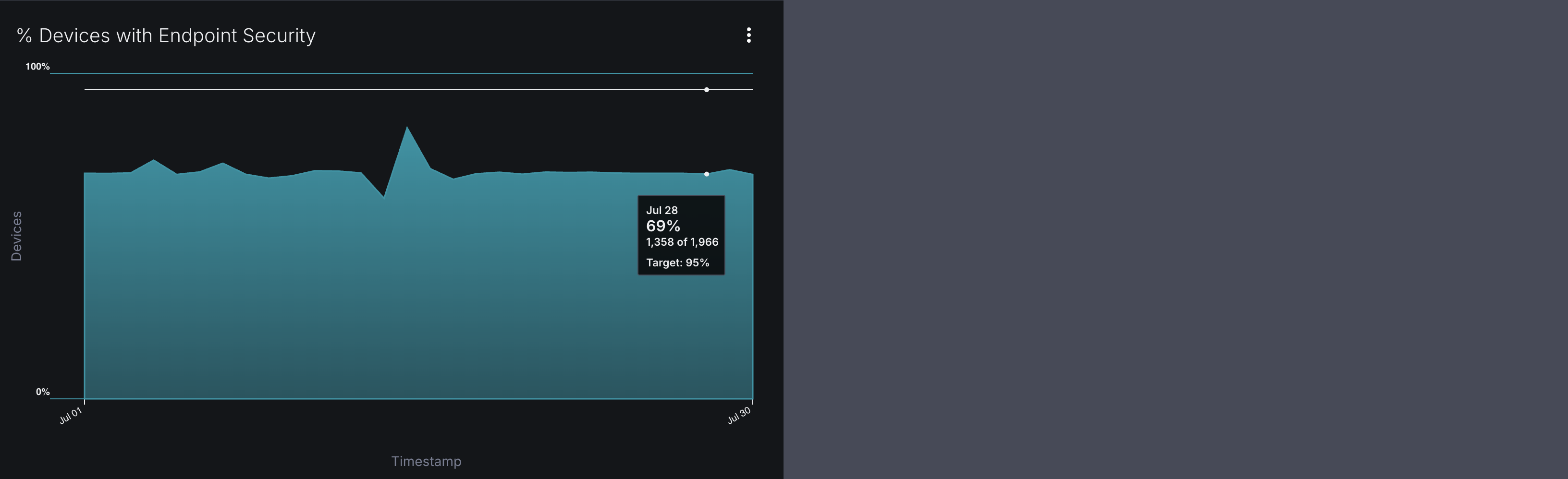
The images below display the configuration and output for a tracked-query area graph that displays the daily number of devices that have endpoint security controls installed for the last 30 days. Two tracked queries were used to identify these daily totals.
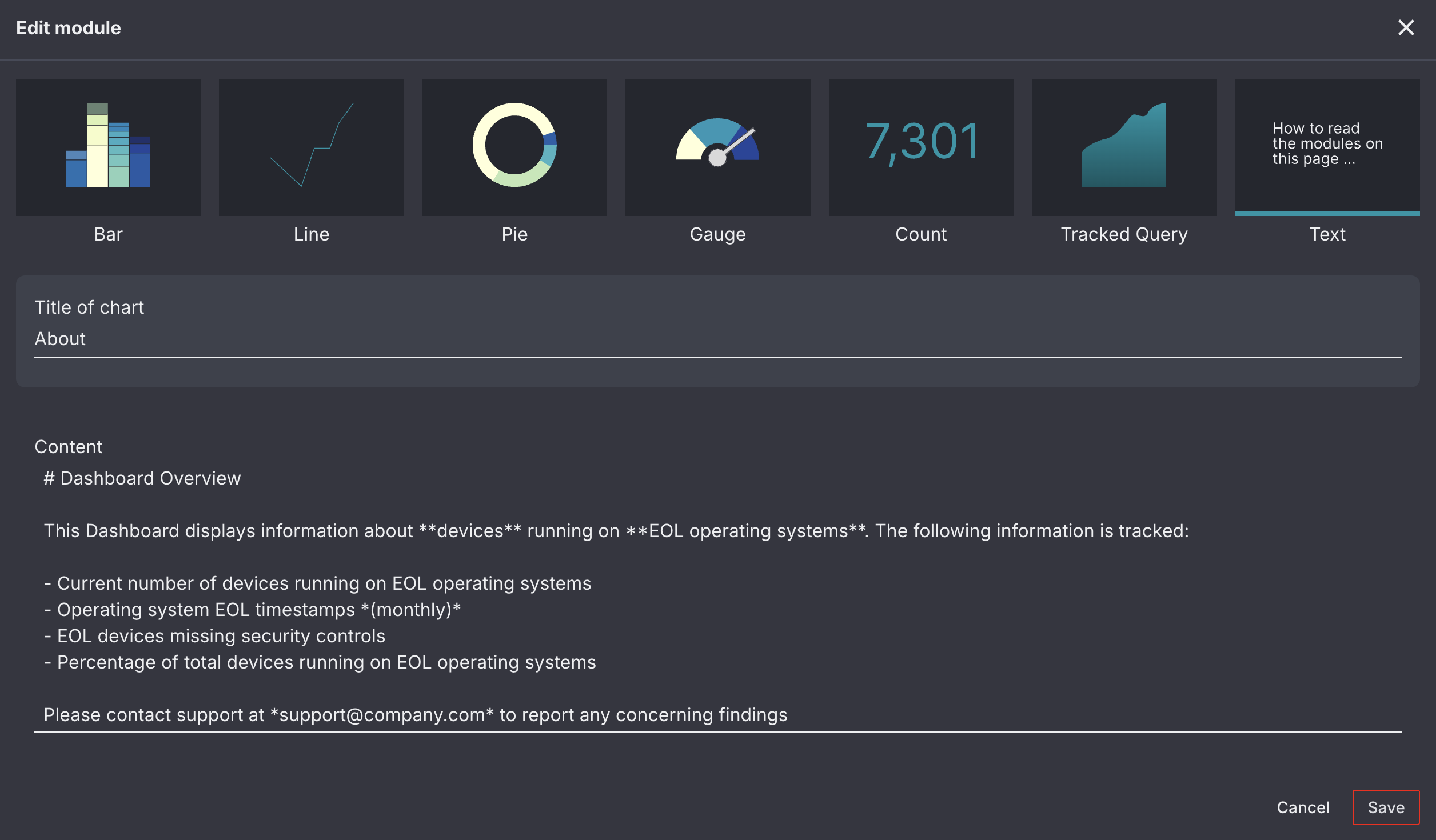
Text
The Text module cannot be used to display asset information; however, it can be used to include important information about your Custom Dashboard on the page. For example, you may wish to:
- Provide an overview of the contents of your custom dashboard
- Provide an explanation for a graph
- Provide instructions for what to do if a module is in a particular state.
The Text module accepts Markdown language, with the exception of tables, allowing you to format your information as you see fit.
The images below display the configuration and output for a text module.
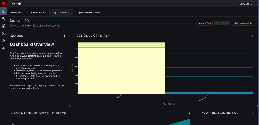
Module Layout
Once you have added several modules to your dashboard, you may wish to resize and arrange how they are displayed on the page. To do this, start by selecting the Edit Layout button in the top-right corner of the dashboard.
Resizing Modules
To resize a module, select its bottom-right corner ( ) and drag it length or widthwise until you have achieved your desired size.
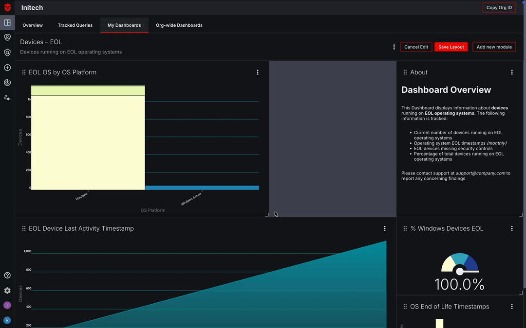
Arranging Modules
To change the placement of a module, select its drag indicator icon ( ) and drag it to where you would like it displayed on the page.
Once you have finished resizing and arranging your modules, click the Save Layout button to save your changes.
Editing and Deleting Custom Dashboards
Note: In an effort to maintain consistency within the Aurora ASM platform, org-wide dashboards have the same permissions as org-wide queries. Consider the following permissions:
- Reader and Admin users can promote personal dashboards to org-wide dashboards
- Reader and Admin users can make edits to org-wide dashboards
- Only Admin users can delete an org-wide dashboard created by another user. Readers can only delete org-wide dashboards they have created themselves.
Editing a Custom Dashboard
Select the Kebab icon ( ) to the left of a Add new module button followed by Edit in the dropdown menu. Make changes as needed using the provided field, then click the Save button.

Deleting a Custom Dashboard
Select the Kebab icon () to the left of a Add new module button followed by Delete in the dropdown menu to remove the Dashboard from your organization.
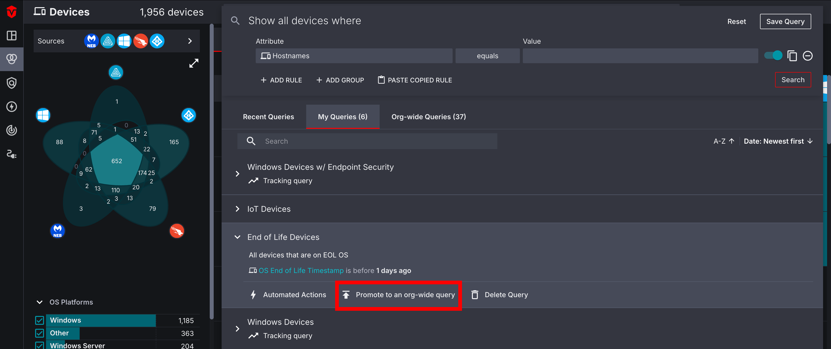
Promoting a Personal Dashboard to an Org-wide Dashboard
Select the Kebab icon () to the left of a Add new module button followed by Promote to org-wide in the dropdown menu. A popup will appear. Select the Promote button to promote your personal dashboard to an org-wide dashboard.
Receiving an Error Message
If your personal dashboard contains any modules that are using personal queries, you will receive an error message. This is because org-wide dashboards only allow org-wide queries to be used in modules.
The error message will contain a bulleted list of all personal queries being used in your dashboard.
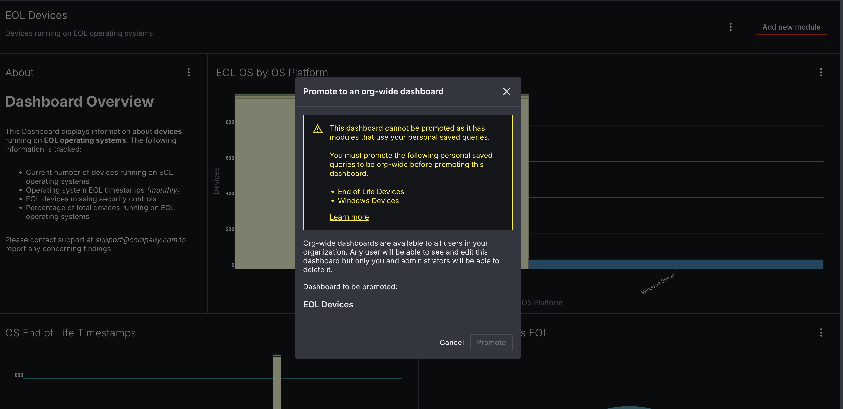
We recommend promoting any personal queries being used to org-wide queries. Once you have done that, you will be able to promote your dashboard.
Editing and Deleting Modules
Editing a Module
Select the Kebab icon () in the top-right corner of a module followed by Edit in the dropdown menu. Make changes as needed using the provided fields, then click the Save button.
Deleting a Module
Select the Kebab icon () in the top-right corner of a Module followed by Delete in the dropdown menu to remove the module from your Dashboard.
Updated 3 months ago